The former and future home of the FT, Bracken House has in its time embodied more than one archetype of the City office block, from 1950s solid sandstone to 1980s high-tech glass and steel. Now John Robertson Architects’ revamp builds a new harmony between those two conflicting identities
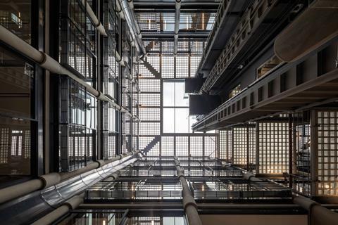
Bracken House in the City of London is a handsome relic of a bygone age of office architecture. First completed in 1958, the brick and sandstone block is from a time when the default office model in London’s financial and oldest district was not a faceless glass tower but a solidly muscular mid-rise masonry building whose proportions, detailing and materials expertly evoked the spirit of local urban heritage.
But it is also a building that has gone through several upheavals, including its reinterpretation as an exemplar of high-tech by Hopkins Architects in the late 1980s. Its latest upheaval is a major refurbishment by John Robertson Architects, aiming to update the building to modern office standards while retaining the uncompromising high-tech character Hopkins bestowed. Critically, it also seeks to foster a more sympathetic connection between the original 1950s block and the phased sequence of new modern interventions.
Bracken House was built between 1955 and 1958 on a cleared Second World War bombsite just south-east of St Paul’s cathedral. It was designed by eminent 20th-century architect and Georgian Group founder Albert Richardson, in a modern classical style infused with light industrial references. Its original purpose as the headquarters of the Financial Times determined the choice of a handsome sandstone exterior, mimicking the pink livery of the newspaper.
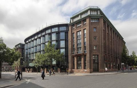
Bracken House is considered one of the best post-war office buildings in the City of London. Intriguingly, its unlikely inspiration was the Palazzo Carignano in Turin, a sumptuous baroque pile that has a wing on each side, enclosing an elliptical central range – just like Bracken House today, though the office building’s original configuration had a rectilinear central range not an elliptical one. This historical reference was also influential during concept design stages of the latest project.
By the late 1980s most of the newspapers traditionally based in the City had left for new pastures in east London. The Financial Times’ departure in 1988 freed the Bracken House site for redevelopment into a speculative office block, and Michael Hopkins’ practice was appointed to the project. Controversially, Hopkins’ initial plan was to demolish the building and replace it with a new glass and steel construction. This was only prevented at the eleventh hour by an August 1987 grade II* spot-listing, which earned Bracken House a place in history as the first post-war building in England to be listed.
Hopkins then quite literally went back to the drawing board and produced the compromise configuration we recognise today. The two brick wings were retained while the central block that previously housed the printing presses was demolished to make way for Hopkins’ high-tech glass and steel central insertion. Hopkins’ efforts were themselves awarded a further grade II* listing in 2013. Now, more than three decades later – and partly prompted by the latest overhaul – the Financial Times is moving back into the building that was its original home.
While it was wider industrial and economic changes rather than any issues with the building itself that earlier prompted the Financial Times to move out, by the beginning of this decade Bracken House was beginning to exhibit problems. In the new refurbishment, addressing these was a priority, as John Robertson director David Magyar explains.
“The building housed an outdated office spec in urgent need of modernisation. Building services were inefficient and lacked current low-energy capabilities. The entrance hall felt limited and constrained. The atrium Hopkins placed at the centre of the plan also felt gloomy and offered insufficient levels of natural light. The building lacked any rooftop amenity. And significantly, the redevelopment sought a better connection between Hopkins’ work and the original Richardson areas, which can sometimes feel separate and isolated.”
In terms of architectural response, the new refurbishment scheme addresses these challenges by dividing itself into three main areas of concern. First is the overhaul of the entrance and atrium. Second is the creation of a new roof terrace. And the final and most structurally invasive intervention is the insertion of two new lightwells into the floorplate to create a better connection between the Hopkins and Richardson volumes.
Entrance and atrium
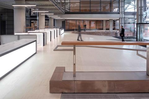
The new entrance foyer has undergone several subtle adjustments to increase its size, impact and connection with the atrium beyond. The reception desk has been moved to the side to allow a clear view towards the atrium. The two bronze and timber screens that frame the lobby have been dismantled and reconstructed in new locations to provide a more expansive feel. And new fixtures such as sparkling terrazzo flooring have been installed.
The atrium occupies the building’s full height. It has a bank of rebuilt glass lifts as its centrepiece and is overlooked by glass-fronted offices on every floor. The space is also surmounted by a large rooflight. Offices from the high-tech era – most famously the Lloyd’s Building – can struggle to achieve good levels of natural light in their internal atriums. So here a central section of Hopkins’ original gridded glass-block skylight has been replaced by clear glazing to increase the atrium’s daylight factor by 150%.
According to project director Zemien Lee, the interventions in the latest refurbishment have been characterised by a finely tuned balance between new and old. “It’s a listed building and we’ve very much retained the spirit of Hopkins’ original language of timber, concrete, terrazzo and stainless steel. But we’ve also tried to reinterpret it and leave our own subtle mark while always remaining respectful.”
Rooftop
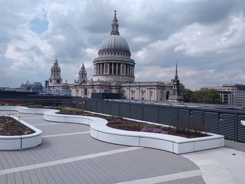
As no roof terrace existed before, there was a large degree of creative freedom in installing an ambitious new one. Intriguingly, Hopkins did plan a roof terrace as part of his original design. But roof terraces were increasingly discouraged in the late 1980s and early 1990s, after the volatility in financial markets triggered by the Big Bang of financial deregulation and the subsequent recession led to alarming rates of suicide in the City, with financial workers jumping from the top of buildings.
Thirty years later, the restricting factor is not suicide risk but viewing corridors. While the new roof terrace offers spectacular panoramas of the city and cathedral, St Paul’s Heights – the invisible viewing corridors through which strategic views of the cathedral must be maintained and within which Bracken House directly falls – imposes a formidable set of design restrictions. The strict datum line imposed ensures that with the exception of the perimeter guard rail, the very highest structure permitted on the roof is low-level plinth seating only located at one end of the terrace. Considering that 60-storey office towers are shooting up just yards from Bracken House, this might be considered an illustration of the contradictions in London’s high-rise planning policy.
There were other constraints, as Magyar explains. “There were structural challenges due to the limited loading capacity of the original roof. We had to ensure the seating and planters comprised lightweight framework and were only clad with Corian [acrylic polymer] rather than built from it, in order to reduce their weight. There was also an amount of tidying up that had to be done in order to preserve views: the BMU [building maintenance unit] crane had to be dismantled, for instance, and we now use alpinists connected to harnesses to clean the windows.”
Nonetheless, within these constraints an impressive rooftop space has been created. And in a poetic nod to the baroque masterpiece that originally inspired Bracken House, the rooftop’s radial paving and seating pattern is an extruded representation of the structure of the Palazzo Carignano’s dome.
Lightwells
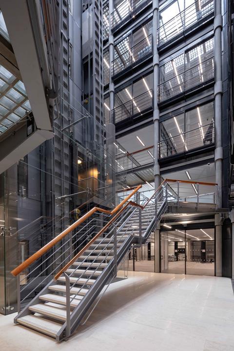
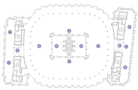
The final major intervention is focused on the two new internal lightwells created at either end of the building. These are located on the boundary between the outlying retained Richardson blocks and the central Hopkins floorplates. They replace former toilet blocks, and Magyar is keen to point out that they do not compromise the total floor area. The building still offers the 200,000ft² of floor space it provided prior to the refurbishment.
The three- and four-storey lightwells were made by cutting into the floorplates to create what Magyar calls “breathing space between the two areas to relieve the tension that previously existed there”. Previously, the connection between the Hopkins and Richardson areas was said to be clumsily abrupt, with little attempt made to consolidate the two. Floor levels that differed from one to the other did not help: although Bracken House is only seven storeys high, there were double that amount of floor levels within the entire building.
Once the hole for the lightwells had been cut, temporary steel props were installed within them to maintain the integrity and stability of the surrounding structure during construction. New steel ring beams tied into the building’s structural frame were then placed around the exposed slab edges, eventually allowing for the props’ removal.
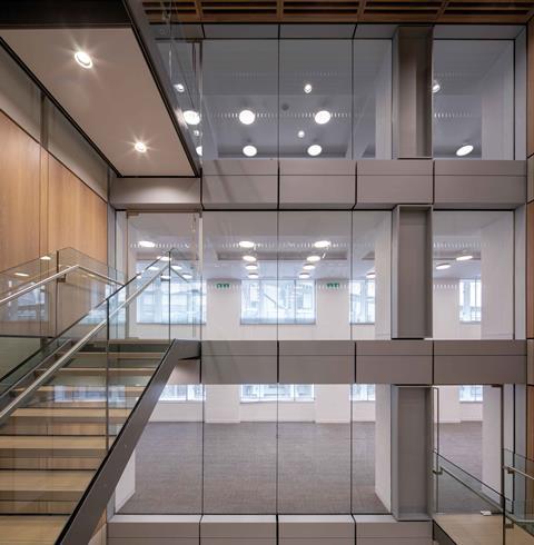
Though relatively modest in size, the lightwells allow a clear separation between the Hopkins and Richardson elements of the building, creating a more legible and honest relationship than before. They also feature the same architectural language employed in the atrium and lobby. They are overlooked by glass-fronted offices, feature oak panelling on the walls and feature exposed concrete and steelwork in their structure and staircases. As such they are effective metaphors for a wider refurbishment scheme that largely succeeds in treading the fine and difficult line between respect for heritage and creative conviction in new interventions.
Project Team
Architect: John Robertson Architects
Client: Obayashi Corporation
Main contractor: McLaren
Structural engineer: Arup
Services engineer: Arup
Internal fit-out: Perkins+Will






1 Readers' comment