Norman Foster’s first residential tower in London sits between the city’s financial centre and its hipster heart, but while it pays homage to Shoreditch’s reputation for urban cool, it is in fact a triumph of architectural corporatism.
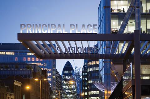
Norman Foster has designed some iconic buildings in London, ranging from the British Museum Great Court to the Gherkin commercial skyscraper. But of all the different typologies of projects that he has worked on in the capital, one – the residential tower – has eluded him. The Corniche, a trio of residential towers on Albert Embankment for Berkeley Homes in 2018, was a Foster + Partners design, but the interiors were designed by others.
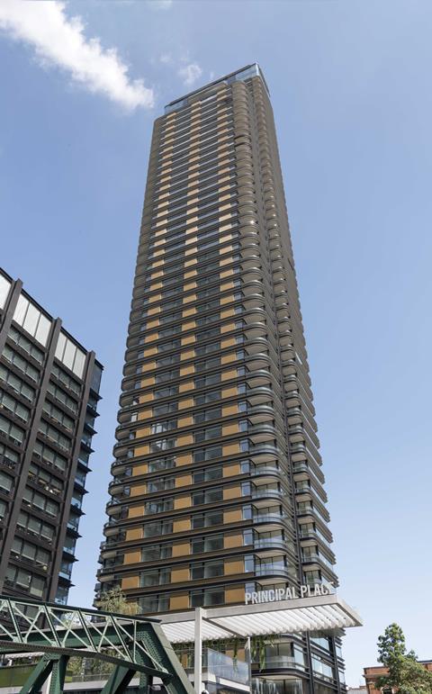
Now, Foster’s first fully designed residential high-rise in the capital has completed. Principal Tower is a 163m-tall 50-storey skyscraper containing 299 luxury flats and located in Shoreditch on the eastern fringe of the City. Unlike the Corniche and other similar projects, Foster has designed every aspect of the building, both inside and out.
The £200m tower forms part of the wider Principal Place development, which saw the opening of Amazon’s UK headquarters two years ago, a vast 600,000ft² office building overlooking the square on which Principal Tower now also stands.
Standing out
Luxury residential towers are a common feature across London, so why is this one different? It is significant for three reasons. First, Foster remains arguably the world’s most famous architect, so his first fully-designed residential tower in his firm’s home city is an important architectural event.
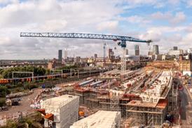
Secondly, like much of the adjacent Broadgate development, the tower is suspended over railway tracks serving the Liverpool Street mainline station, so he had to devise a structural strategy of considerable engineering dexterity and ingenuity for it to see the light of day.
And finally, Shoreditch was originally London’s hipster quarter, the alternative, counter-cultural haven whose converted heritage buildings played host to the edgy creativity and youthful non-conformity that has been responsible for the area’s astonishing cycle of gentrification and regeneration over the past two decades.
But, as the City extends eastwards with the ever-increasing encroachment of tall buildings and a more corporate office culture, how can the unique urban character of Shoreditch be consolidated within the more corporate architectural and cultural outlook?
In the 1990s, another showpiece Foster scheme, the nearby redevelopment of Spitalfields market, tried to provide the answer with mixed results. Principal Tower, now by far the tallest building in Hackney and one of the tallest residential buildings in London, attempts to bring that answer right up to the 21st century.
Principal Tower is Building 2 in a collection of five buildings arranged around its adjacent square. The 15-storey Amazon HQ forms Building 1, while Buildings 3 to 5 offer shared ownership and social housing units in a series of low-rise blocks.
“In engineering terms, it’s the last place you’d want to build a skyscraper,” says Rony Imad, Foster + Partners’ associate partner, of the challenges of building 50 storeys over underground railway tracks. The railway constraint affects several buildings in the Broadgate development – one-third of the overall Principal Place site is suspended in this manner – but many of them have used the fact to their advantage by devising an exposed and expressive structural solution that conspicuously informs the architecture of the finished building. For instance, at SOM’s Exchange House on Broadgate Square, the entire building is literally suspended from a giant eight-storey arch. At the same practice’s Broadgate Tower opposite, a series of dramatic A-frame arches enclose an external plaza and hoist the building above the hidden tracks below.
Beneath the surface
At Principal Tower, the solution is deliberately more discreet. An early design decision was taken not to adopt the conventional visible arches or A-frames often used on Broadgate as the architects felt the vast majority of the public would not understand the link to the underground railway and that the look of a building that appeared to be built on solid ground was preferable.
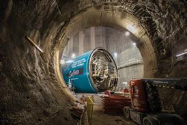
So instead, what was effectively a new superstructure tunnel was created around the actual tunnel below. This was formed by gigantic reinforced concrete capping beams measuring 7.2m deep which are supported by 1.8m diameter piles rammed into the ground.
Two of these beams are 14m and 70 tonnes in weight and form the principal transfer beams onto which several of the tower’s columns rest. The raft structure formed by this arrangement supports the tower’s weight and is the reason the plaza beside the tower is raised above street level and approached by a series of steps and ramps.
The building’s architecture and elevations give virtually no clue as to its hidden engineering arrangement
Because of the orientation of the building and the need to divert loads away from the adjacent foundations of the historic retained Light Bar brasserie that sits on the eastern corner of the site, further engineering complexity was also required on the eastern side of the underground superstructure tunnel created to support the tower. This side of the tunnel is framed by eight 50m-deep piles but a lack of space and depth meant that the tower columns on this side of the building could not bear directly on to the raft structure.
So a series of transfer structures formed by a maze of concrete walls and slabs winds its way down through the building from level seven directly down to the piles themselves rather than the roof of the raft structure. This side-heavy composition is contained within two 800mm x 450mm steel columns on the eastern side of the building and the appearance of one of these in the building foyer is the only clue as to the advanced structural gymnastics taking place above and below.
Consequently, the building’s architecture and elevations give virtually no clue as to its hidden engineering arrangement. Instead we have a strongly horizontally articulated tower whose full height is expressed as a series of linear glass surfaces contained within metal strips.
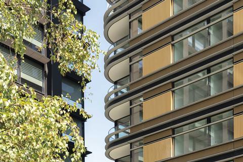
Metal cladding of various shades, tones and texture is used across all five Principal Place buildings but the cladding on the tower is brighter than the more matt finish applied to the Amazon HQ below. Its form is further softened by its curved corners and the series of projections and balconies woven into the external surface. In fact, the constant horizontal striations coupled with the black finish give the building a feint but welcome art deco feel.
These features do also help to soften the exterior of the building and render it less severe and corporate than the Amazon HQ. However, this is counter-balanced by Foster’s trademark level of precision and control, elements which, when combined with the same large glazed expanses of the office next door, are still weighted more to the corporate than the residential feel.
Equally, while the architectural desire to create a more grounded building is understandable, one cannot help feeling that the exteriors may have been enlivened had they expressed the structural contortions taking place within and underneath the building in order to accommodate the tunnel below.
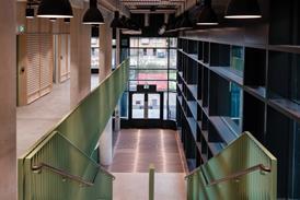
However, such reservations largely vanish when inside the building. The foyer reveals itself as an elegantly chaste double-height volume with honed concrete surfaces and tight minimalist detailing. Pride of place goes to a spectacular helical staircase decadently encased in black steel and tumbling downwards from a mezzanine level whose gym, sauna, swimming pool, cinema room and lounge are indicative of the amenity expectations that high-end London living now demands.
Interiors are trimmed with a mixture of plush marble, bronze, steel and wood finishes, elements that inevitably culminate in the spectacular twin 464m² penthouses at the top of the building
The theme of lavish decadence is maintained within the flats themselves and Imad reveals some of their principal features: “All flats are double aspect, they all have balconies and en-suites, none of the windows have mullions and flat sizes are very generous, a three-bed is up to 130m².” There are essentially three flat types as one moves up the building, City House, Upper House and Penthouse, each one aspiring to a greater level of luxury than the one below. That said, all three reveal impressive levels of ostentation – interiors are trimmed with a mixture of plush marble, bronze, steel and wood finishes, elements that inevitably culminate in the spectacular twin 464m² penthouses at the top of the building.
The floor-to-ceiling glazing that might be inclined towards corporate anonymity externally reveals its worth inside by ensuring that every flat enjoys breathtaking views over the City and east London. The balconies too, usually set behind the curving corners, are generously sized and, placed behind a level threshold, almost become extensions of the interior space.
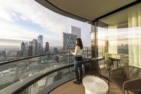
A highly efficient floorplate measuring approximately 20m x 20m usually has six or eight units per floor and, due to the installation of sprinklers in all flats, is served by a core offering just three lifts and two staircases.
So what about the more complex issue of how Principal Place fits into the character of Shoreditch? Foster’s redevelopment of Spitalfields market provided a bruising precedent for how difficult it is to marry corporate interests into a historic residential neighbourhood and while, in the intervening period, Shoreditch has changed rapidly and is now host to several tall buildings, can these two potentially opposing conditions ever be successfully reconciled?
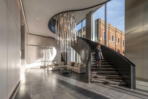
Accordingly to Foster + Partners director Grant Brooker, who also worked on Spitalfields, the answer is a resounding yes. “I’m a huge fan of edges and this one brings up all manner of opportunities – rather than just putting up another City tower, we’ve tried hard to make this one celebrate the character of Shoreditch,” he says.
“It does so by its materials. We wanted a dark metal to celebrate this area’s industrial past. It does so by its mix of uses – residential is rare in the City but not in Shoreditch and the live-work dynamic is a key part of its energy.
“The whole development is centred on a new public space that will have amenities for all and will provide new permeable cross-routes for the neighbourhood. It provides a mix of residents. Private and social residents are located right next to each other on the same site.”
Brooker is also convinced that a tall building is appropriate for the site, despite controversy over previous additions to the Shoreditch landscape. The furore over the Bishopsgate Goodsyard development opposite is a case in point.
“Tall buildings can’t work everywhere – they shouldn’t be next to the Houses of Parliament, for instance. But, with a slim and slender tower on a dense, inner-city site such as this one, served by such excellent public transport links, they reflect the reality that the City has to grow.”
Project Team
- Client: Principal Place Residential Development
- Architect: Foster + Partners
- Main contractor: Multiplex
- Structural engineer: WSP








No comments yet