Foster + Partners’ headquarters for multinational Bloomberg breaks with recent tradition for City of London buildings by respecting the architectural context of its surroundings. And it’s all the better for it
The proverb “if at first you don’t succeed” wasn’t written by an architect but, if it had been, it would have been penned by Norman Foster. Exactly 21 years ago this month he unveiled plans for his London Millennium Tower in the City of London. At 386m high, the 92 storeys skyscraper would have been almost a third taller than today’s Shard and the sixth tallest building in the world. A firestorm of opposition promptly led to the project being shelved, but not before – to the more cynically minded at least – it had conveniently smoothed the planning path for its tall but not quite as tall replacement, the Gherkin.
A similar Lord Foster reanimation process has now concluded this week on his latest project, the reportedly £1bn new European headquarters of media, data and software giant Bloomberg, again in the City of London. Initial 2006 plans for Legal & General featured a 22-storey glass structure dubbed “Darth Vader’s helmet” by critics and germinated in collusion with City provocateur Jean Nouvel. Mercifully, that particular bubble was burst by the 2008 economic crash and after a total redesign, the new Bloomberg building is the result.
And it could not be more different from its galactic predecessor. Not only can this one lay claim to a raft of pioneering environmental measures that have secured it the enviable accolade of highest BREEAM rating of any major office development in the world. But, encased in so much luscious, sunburnt sandstone that the Derbyshire quarry from which it was mined is now allegedly empty, this is a building that, as mogul and former mayor of New York Michael Bloomberg himself explains, has been built as an ode to London.
At the official opening of the building, he said: “I didn’t want just another glass skyscraper; I wanted a building that respected London’s aesthetic tradition. I’m a guest in this city and I feel incredibly privileged and honoured to build on this site and be at this historic location. I wanted a building that showed that.”
Hence the aforesaid sandstone is a match to the exquisite freestanding Italianate palazzo of the City of London Magistrates’ Court next door, dating from 1873. And hence the building is only 10 storeys high rather than the 22 storeys assumed by its predecessor and allowed by planning. As both Bloomberg and Foster explain, this was a self-imposed height restriction enforced (by Bloomberg) to create a volume that matched the surrounding streetscape.
In practically any other historic city this would be an architectural statement of the obvious. But in a London, where planning has allowed floorplate maximisation and opportunistic development, this is an extraordinary act of commercial restraint and civic responsibility.
But here at least we have a building trying to harmonise rather than harass its context. And “contextual” is a word the Foster + Partners team use to describe this project again and again. The Bloomberg building occupies an entire city block and covers 3.2 acres. Two buildings of equal height sit on the site and are divided by a new pedestrian route that, in a masterful civic gesture, follows the path of the old Roman route of Watling Street. Consequently, it is also aligned to the road’s modern-day equivalent that extends west from the site to St Paul’s.
This is the first evidence of a scheme that, despite its scale, displays remarkable sensitivity to public realm and local urban grain. For most of the block the building footprint hugs the site boundary line, but at three strategic points it pulls back significantly to form three new public spaces, each one peppered with dynamic examples of public art. These mini-squares, particularly the most easterly one, which overlooks Wren’s adjacent St Stephen Walbrook church, are spatial pivots that anchor the project into its surroundings and engage in the tradition of informal, irregular and spontaneous public space that is such an intrinsic part of the City’s character.
Equally, in another generous civic gesture, the entire ground floor is given over to retail and restaurants set beyond a continuous lofty colonnade. This creates a vibrant street-level campus that animates the local streetscape and humanises a corporate building type that can all too often appear anodyne and impermeable.
In fact, the only regret here is that the new dividing street is called Bloomberg Avenue and that it is covered by a glass roof – both of which factors only serve to emphasise the hermetic corporate introversion that all too frequently severs office developments of this ilk from their surroundings.
Classical facades
An incredible 8,400m³ of stone was used to build the Bloomberg headquarters, and virtually all of it is visible from the exterior. Each elevation is split into a series of formidable full-height bays framed by chamfered stone columns. These bays are then further subdivided by groups of three, four or more glazed openings, each one set beside an extraordinary phalanx of bronze fins cast at an angle to the window.
If this diagrammatic arrangement sounds classical, that is because it is meant to be so; Fosters partner Michael Jones directly alludes to classical influences on the elevations in order to help consolidate the building into its historic surroundings. Further evidence of this comes with the vertical articulation of the blocks, which follows the basic classical ordering system of bottom, middle and top.
The top is expressed as an attic storey set back from the face below, the middle sees the grid of bronze fins set within stone bays and at the bottom the columns swoop down to form the freestanding pillars that frame the colonnade.
So essentially, the offices are hoisted above a continuous podium. Annoyingly the midsection above this podium engages in the cheap visual trick so beloved of residential developers of combining two storeys to make them appear as one in order to make the building appear shorter than it is.
But there is no denying the fact that this is a big, hulking block – nor should there be, in a part of London where the tradition of corporate exhibitionism through showpiece architecture is hundreds of years old. Moreover, for the most part, the simplicity of the form and facades and the incredible richness of the stone make for an assured and handsome building.
But while there is no problem of scale, there is one of proportion. The individual components that comprise the facades – the columns, fins, windows – all seem too oversized and chunky, as if the building was designed to be half this size and then mistakenly exaggerated at the very last minute. The ratio of solid to glass also seems weak; for all the plethora of masonry, this feels like a glass building that has hurriedly donned stone fancy dress in order to sneakily gain entrance to the exclusive club occupied by its older neighbours.
There is also a problem with repetition. Foster treats architecture like a science, and there is a forensic systematic rigour to all his work. But there is not a forensic systematic rigour to the haphazard urban fabric of the City of London, and the multiplication of what is essentially the same elevational motif to enclose 1.1 million ft² of office space begins to verge on the formulaic contrivances of suburbia.
Reinterpreting the office
This is partially a site problem that is hardly the fault of the architect. Much of the City is not occupied by single buildings of this size and the charm of its historic streetscape largely comes from the jumbled assortment of smaller buildings jostling for position along crowded street frontages. But the Bank of England next door occupies a similar plot size to Bloomberg, yet here we see that building’s main architect John Soane employing an extraordinary dexterity of elevational treatments in order to respond to the various urban conditions that surround his seminal screen. Such deftness of touch would have been welcome at Bloomberg.
“We didn’t want a building that makes itself immediately apparent the moment you step inside,” explains Jones. “We wanted a building that unveils itself in stages and capitalises on the element of surprise. In short, we wanted something dignified on the outside but dynamic on the inside.” And this, in the most spectacular way possible, is what the interior of the new Bloomberg headquarters achieves.
The office entrance lobby is a simply extraordinary space, and nothing about the quasi-classical exterior quite prepares the visitor for it. Three interlocking elliptical timber shells swerve and swoop over each other to huddle around a double-height, almost windowless space that more resembles a sunken cave than an office atrium.
In fact, with its womb-like form and spartan, uncluttered expanse, this is a merciful departure from the tedium of whitewashed desks, barriers and seating that fills most office lobbies. It forms a full-bodied repudiation of the traditional office entrance model that could just as easily front an opera house or art gallery. In this single illusory space, Foster does what he does best: reinterprets convention through visionary reinvention.
And there is more to follow. To reach the office space above, you choose either a sleek bank of lifts or a narrow curving staircase squeezed between two of the lobby shells. And here the architecture changes gear again, and around us unfurls an astonishing vortex of space that gyrates its way up through eight floors to the very top of the building (see main picture on opening page). Around it lie the office floors themselves, each one linked to the other by what must be one of the most extraordinary structures to ever grace a London office building.
A remarkable series of elliptical ramps cascade down from the summit like swirling ribbons hurtling towards the ground. Foster has long played with the principle of ramped domes from his Reichstag overhaul through to the GLA Building and beyond. But where those ramps were rational, sequential forms, this one is wilful and dynamic, endlessly shifting and swerving. The power of the spectacle is heightened by the fact that the atrium itself is an irregular shape, formed from a stack of differently sized and shaped elliptical floorplate openings that stagger obliquely above each other to cast a dizzying variety of views and glimpses from one floor to the next. With its ramped tendrils and gaping voids, this riotous space evokes a dynamism that is as far removed from traditional office design as it is from the stately rhythm of the exterior.
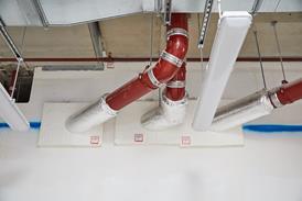
Something else that is far removed from traditional office designs is the office ceilings, and these are linked to the building’s superlative sustainability credentials. The ceilings are lined with thousands of polished bespoke aluminium “petals” that incorporate half a million LED lights and also combine cooling and acoustic functions through a cooled rather than chilled beam system. Incredibly these combined ceiling panels only require a depth of 100mm, a crucial factor in helping the building achieve its 2.9m floor-to-ceiling height while maintaining the low-rise volume Bloomberg insisted upon.
Additionally, the bronze fins visible from the exterior actually act as opening “gills” which, when the building is in “breathable” natural ventilation mode, can open and close to admit air. This is channelled through the building, drawn up through the central atrium and extracted through the glass oculus at its summit following passive ventilation and chimney effect principles that reduce reliance on mechanical ventilation.
The offices themselves also incorporate pioneering ideas with regard to the evolution of the workplace environment. While hot-desking was explicitly rejected at Bloomberg’s personal instruction, a more localised approach to communality has been encouraged with desks arranged into “neighbourhood” clusters and engineered to rise in order to accommodate working while standing. Transparency is paramount – with virtually no meeting rooms – and social interaction is encouraged throughout, even on the ramps which, allegedly, are wide enough to encourage spontaneous interaction while maintaining circulation.
For all its pioneering energy, this is an office that looks as much to the past as it does to the future. Like OMA’s New Court building for Rothschild, which overlooks the Bloomberg headquarters from its new Walbrook Square, it represents the architectural consolidation of private wealth and civic amenity.
But this is a tradition that stretches back for centuries and is firmly embedded in all the commercial palaces that comprise the City’s fabric, whatever their style. If this re-energised form of corporate endowment can also incorporate the civic responsibility that Bloomberg has shown by eschewing the default of the tall building and engaging with the public realm, then a new more enlightened generation of London commercial architecture may have an American influence to thank for helping it to rediscover its roots.
Project Team
Architect: Foster + Partners
Client: Bloomberg
Main contractor: Sir Robert McAlpine
Structural engineer: AKT II
QS: Aecom
Lighting engineer: Tillotson Design Associates
Building services engineer: Sweco
Follow Ike on Twitter @ikeijehView full Profile
No comments yet