Lego’s new showpiece attraction in Billund, Denmark, combines exhibition space and the Lego experience in a building designed by Bjarke Ingels Group to reflect the company’s core values and its concept of play. Basically, it looks appealingly like a collection of toy bricks.
There can’t be many toy brands more overtly associated with the process of architecture and construction than Lego. Ever since Danish wooden toymaker Ole Kirk Christiansen bought, against his colleagues’ advice, an old plastic injection moulding machine in Croydon in 1946, the company that reportedly replaced Ferrari as the world’s most powerful brand in 2015 has been churning out miniature multicoloured bricks to the delight of children – and a surprising number of adult enthusiasts – across the world.
Last year Lego sold an astonishing 75 billion Lego bricks, but, yesterday, 21 supersized versions officially opened as Lego House, the company’s showpiece visitor attraction located in its home town of Billund, Denmark. It offers exhibition and experience spaces as well as a historical Lego museum in its basement, plus the attendant cafe and restaurant amenities. Not be confused with Legoland, which is less than a quarter of a mile away but was sold to British attractions company Merlin Entertainments in 2005, Lego House has been designed by celebrated Danish practice Bjarke Ingels Group (BIG).
The irony of building a real-life home for a company whose products are used to build toy houses has not been lost in the architecture of the new venue, which even calls itself “the Home of the Brick”. As Lego House general manager Jesper Vilstrup explains, it was a connection of crucial importance to the architectural concept.
“The building itself reflects what Lego play and the Lego values are all about. The Lego brick has been incorporated into the architecture in a simple but ingenious way and visualises the systematic creativity that lies at the very core of all Lego play.”
The exterior
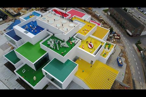
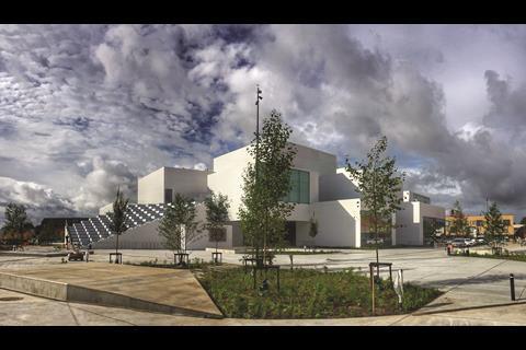
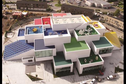
This connection between brand and building is a constant architectural refrain throughout the building and is evident at first sight. The new building sits on a large new square in the centre of Billund. The structure is formed by 21 stacked blocks that converge to create a tapering, ziggurat-like structure 30m high, topped by an array of staggered terraces.
Bjarke Ingels, the practice’s founder, describes the exterior thus: “The Lego house appears like a cloud of interlocking Lego bricks that form spaces for exploration and exhibition for its visitors within. On the outside the pile of bricks forms the roof of a new square as well as a mountain of interconnected terraces and playgrounds for the citizens of Billund.”
The external walls are clad in ceramic white tiles finished in brilliant white. There are occasional bursts of colour: for example, two sets of steps that lead down from a roof garden have soffits finished in bright, Lego-patented yellow and green. But overall the impact is sombre, clinical and monochromatic, more akin to the minimalist, angular precision of a large art gallery or a US medical facility than a toy brand famous for its multicoloured pigmentation.
This, however, is no bad thing. While Lego colours may work well on a child’s bedroom floor, their supersized impact on a town square would veer dangerously into caricature. And a far more interesting project would be one that seeks to architecturally reinterpret Lego branding rather than recreate it. This is the central design challenge the architecture had to meet throughout the building.
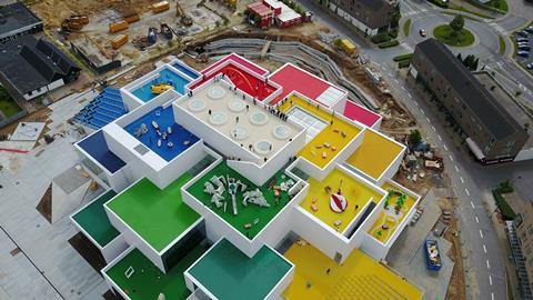
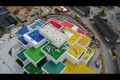
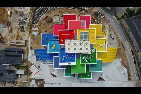
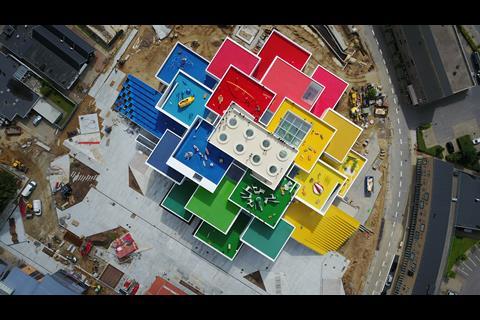
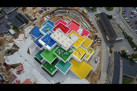
The exterior therefore conveys the spirit of Lego in two more subtle ways. First, the block that surmounts the building is based on the 2 x 4 proportions of a Lego toy brick. And a bird’s eye view of the building, admittedly only partially visible from the roof garden at the top, reveals that each of its multiple terrace floors are brightly decked in vibrant Lego colours. So what appears monochromatic in elevation becomes polychromatic in plan, a subtle architectural rendition of the systemised reconfigurations that Lego bricks offer within a play context.
The world of play
Ingels sees the idea of systemisation as an essential crossover between the world of play that Lego inhabits and the physical environment within which the building’s architecture must operate. “The Lego House could be conceived as a village for playing and learning – an urban space as much as architecture. We have approached the spaces and activities for the Lego House through the lens of a core element of Lego’s philosophy – inventing the future of play through systematic creativity.”
The name Lego itself is an abbreviation of the two Danish words “leg godt” which literally translates as “play well”. The theme of play therefore dominates the interior – eventually.
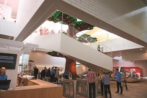
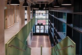
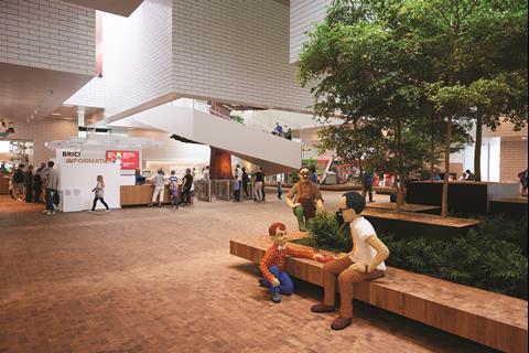
But first, a large entrance atrium is encountered when entering the building known as Lego Square. With its white, tiled surfaces and parquet floor, it continues the exterior’s adult sobriety.
But it is a sobriety charged with electric bursts of geometric and structural complexity. The rectilinear nature of the elevations is maintained but dramatically enlivened by a series of perilous overhead corner cantilevers framing double- and triple-height voids, through which shafts of daylight wash downwards from rooftop skylights high above. In its own way, the dynamism and spatial movement of this space is an architectural form of play in its own right.
But the more literal forms begin as we ascend an angular helical staircase that wraps around an extraordinary 15.5m-tall tree painstakingly constructed of no less than 6.3 million Lego bricks. This is the first figurative representation of Lego we encounter in the building, and there are more when we reach the top of the staircase at the venue’s summit.
The Masterpiece Gallery contains three giant Lego sculptures that are the only source of colour in an otherwise white, double-height art gallery-esque room. Three circular skylights punctuate the ceiling and it is these that reveal, on closer inspection, that in its shape and proportions the room is in fact a supersized, crystalline representation of the interior of a Lego brick. Even the trio of skylights above are inspired by the circular connecting nodules that fit the bricks together. Again, the inference is subtle and easily missed. But, also again, it indicates the revisionist discretion with which the building seeks to act as a metaphor for the brand.
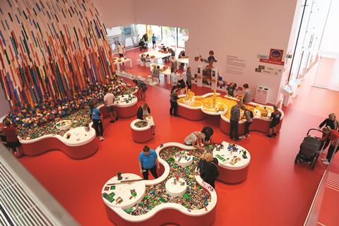
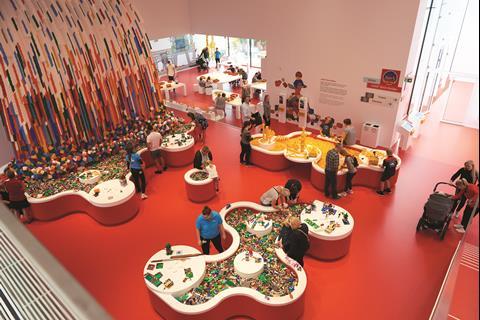
Beyond the Masterpiece Gallery and for the rest of the building, full-blooded and multicoloured play mode breaks out. The exhibition or experience spaces are split into four colour-coded zones: red for creativity, blue for cognitive function (which even includes a city architect section), green for social interaction and yellow for emotion.
The zones are inhabited by a series of fascinating interactive installations designed to appeal to both adults and children. Significantly, this is no static theme park where visitors are invited to ponder the likeness of miniature recreations of Buckingham Palace or the Statue of Liberty. Visually the architecture recedes into the background so that attention focuses solely on the installations, other than the requisite colour theme being applied generously to each zone and its attendant terrace.
The only other location where Lego’s trademark colours make an appearance is a secondary staircase decadently lined with a multicoloured array of ceramic tiles. The museum at its base offers a standard “black box” exhibition experience where a chronological arrangement of historic toy products invites older visitors to revel nostalgically in the Lego brands of their youth.
Ingels summarises his work here in the following terms. “The Lego House is both expressive and rational. Innovative and systematic – like a Guggenheim of white cubes, combining the functionality of the modular space with the iconic character of a sculptural building.”
“Iconic” is a word much overused by architects. But the Lego House proves that iconography is associated more with what a building represents rather than with what it looks like. As observed earlier, in external massing and elevation at least, the Lego House looks streamlined if unremarkable: a solemn, angular pile of blocks.
But what it represents is far more interesting, namely the childlike-concept of play and the adult nostalgia for it. Of course, it also represents the global corporate giant that is Lego and the billions of genuinely iconic toy bricks it produces. The true achievement of this building is that its architecture generally does this by avoiding contrived literalism and instead employs the more subtle illusory philosophy of a systemised metaphor – much like the famous Lego bricks themselves.
Project Team
Architect: Bjarke Ingels Group
Client: Lego
Main contractor: MDE + Brødsgaard
Structural engineer: Cowi

Follow Ike on Twitter @ikeijehView full Profile












No comments yet