Manchester’s thirties Central Library was a warren of rambling interiors and inaccessible book stacks. But then Ryder Architecture got to work on an edited version
Big, Victorian and classical, Manchester Central Library is precisely what most people expect a venerable public building to look like. Complete with a thrusting portico and monumental colonnade, the distinctive circular building is as much a demonstration of mercantile wealth and civic pomp as it is about literature and learning. Part of an extraordinary complex of conjoined, landmark civic buildings that includes Alfred Waterhouse’s exuberant neo-gothic 1877 Town Hall next door, the grade II*-listed library lies at the civic heart of Manchester and is one of the most recognisable public buildings in the city.
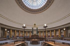
But this does not mean it has been without its problems. Designed by eminent civic architect Emanuel Vincent Harris in 1934, it was dressed in the magisterial interwar neo-classical style he convincingly replicated on city halls in Sheffield, Leeds and Bristol and, less successfully, on the ponderous Ministry of Defence in London. At Manchester, only two spaces within the library lived up to the visual spectacle established by the exterior: the Shakespeare Hall, a noble double-height entrance hall, and the Great Hall, a spectacular domed first-floor reading room that acts as the physical and symbolic heart of the building.
Making restoration invisible requires an enormous amount of structural and technical ingenuity
But not everything was quite this dignified. To call the former internal layout of Manchester Central Library labyrinthine would not do it justice. It was an intricate warren of staircases, rooms and corridors distributed across a series of levels, the combined unintelligibility of which was compounded by the building’s radial configuration. That the library lacked a single main vertical circulation core across its six levels also added severe limitations to way-finding and accessibility.
The final issue was cultural, but significant. It was not just the building’s architecture that sympathised with the US public building tradition of monumental neo-classicism. The internal layout and organisation was also based on the American library system. Whereas the traditional British system leaves most books on display for the reader to browse at their leisure, here a 70/30 split was adopted, with most books hidden from view and accessible only on request from a member of staff.
It is these problems that Ryder Architecture has sought to address in its comprehensive £40m redevelopment. Reopening to the public this week, the library has been completely transformed by a combination of lovingly restored historic interiors and bold contemporary interventions that radically overhaul both structure and circulation within the building.
The unilateral application of so much glass and white steel lacks subtlety and evokes incongruous connotations of corporate offices, or a shopping centre
The redevelopment is part of a wider Town Hall Complex transformation programme. This also involves the refurbishment of the eclectic, Gothamesque Town Hall extension building, also by Harris, that separates the library from Waterhouse’s Town Hall. A glass link building by Ian Simpson Architects will also eventually connect the library to its neighbour, while extensive improvements are being undertaken within the sequence of linked squares and public spaces that surround the complex. But due to its very public role, it is arguably the library’s redevelopment that will have the biggest impact on the city.
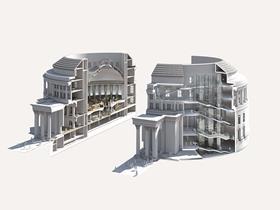
Essentially, Ryder’s whole design concept rests on two fundamental architectural interventions. The first was to introduce a continuous, centralised vertical circulation core into the building for the first time. And the second was to reverse the 70/30 ratio of books on display. Both visions have an enormous impact on the building’s wider renovation programme.
Core strategy
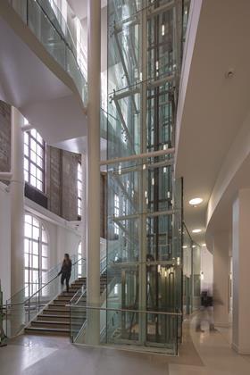
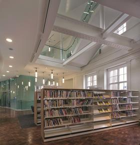
Of these two interventions, it is the new core that has by far the biggest visual impact. On plan, the building - which turns out to be more elliptical than circular - is roughly split into four quadrants located along the outer edge of the envelope and separated by the massive domed drum of the reading room in the middle. One of these quadrants has been gutted across the full height of the building and the new circulation shaft, comprising a staircase and glazed double lift shaft, has been inserted in the void.
As the exterior of the building remains unchanged, this core provides the biggest opportunity on the project for the new architecture to express itself and make an impact on the visitor. It does so determinedly, its protrusion of glass and white steel beams and columns starkly abutting the chaste, pale, maku marble of the original surrounding walls.
The concept of honestly distinguishing between old and new is a well-established conservation principle and is therefore an appropriate design response here. However, the unilateral application of so much glass and white steel lacks subtlety and evokes incongruous connotations of corporate offices or a shopping centre. But, by cutting such a significant full-height void into the building, a brave intervention in a historic listed structure, the library has vertical clarity and legibility for the first time, as well as a new spatial counterbalance to the prominence of the central reading room.
Moreover, by cutting a void somewhat larger than that required by the lift and staircase alone, the core becomes an atrium, casting out new views and perspectives into various floors and spaces. Although the library’s warren-like interiors, like the perplexing alleyways of a medieval town, do not help its legibility, they are part of its convoluted, multi-layered charm. Ironically, the atrium helps to reveal this complexity while doing its best to erode it.
Shelf improvement
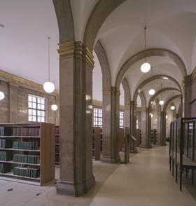
The second major architectural gesture is also rich with irony. For while it represents an even more invasive structural intervention than the core, it is completely invisible to the public. In order to make the previous US library system work, the building needed several floors filled with book stacks hidden from the public. These were located on four levels located beneath the central reading room. As the reading room is on the first floor, the top book stack level was a serious impediment to the access and circulation on the principal ground floor.
But even more inflexibly, the rows of steel stacks and bookshelves actually formed part of the building’s structure, helping to support the concrete floors above.
Despite this essential role, Ryder quickly realised that these stacks were a significant obstacle to the clarity and legibility it was seeking to implement throughout the building. So the stacks have been removed, with the structural role they once performed now undertaken bya new steel frame outer ring laid underneath the circular perimeter of the reading room.
The ground-floor area below the reading room is now a large, open, circular space that contains a mixture of reception, reading and circulation areas. The basement levels below are occupied by archives fitted with new space-efficient mechanised stacks and maintaining BS 5454:2000 environmental conditions for the first time.
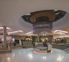
This clever structural solution has completely transformed the way in which the public uses the library. The new ground-floor reception rotunda is now unmistakably the public heart of the building. But it does not express the sobriety one might expect of a traditional library interior. Rather, it is conceived as a bright, multifunctional arena that offers all manner of amenities from private study areas to British Film Institute cinema pods.
Despite this functional variety, there is again, as with the atrium, a cold sterility to this space, and with its touchscreen terminals, white surfaces and conspicuous overhead luminaires it has more of the slick anonymity of an airport terminal than a library. There are two exceptions: an oculus cut into the centre of the ceiling revealing tantilising views of the Reading Room above; and the small section of steel book stacks that has been retained in one corner as a poignant reminder of the library’s former state. While the oculus is framed by an overdone lantern feature hanging above circular desks, both of which demark the centre of the rotunda with all the subtlety of a dartboard’s bullseye, it does allow intriguing views into the reading room above. And the preserved stack is now ethereally encased behind a softly-lit glass screen, glowing like jewels stored in a cabinet.
The remainder of the project is principally concerned with restoration and minor reorganisation of rooms and facilities, all of which is sensitively and efficiently executed.
The remediation of conservation aberrations from previous decades is a recurring theme, such as the removal of boarding inexplicably placed in the seventies over the Shakespeare Hall’s elaborate stone balustrades.
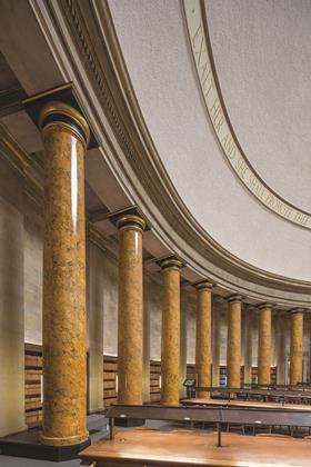
The crowning glory of the building remains its magnificent reading room. Along with Liverpool’s Picton Room and London’s former British Library this is one of the finest reading rooms in the country and, with its giant order scagliola columns and senatorial scale, it is arguably its most imposing. Its meticulous restoration is indicative of the forensic level of care and sensitivity lavished on this reinvigorated historic building.
But its most intriguing feature is arguably its most prosaic, though it perfectly reflects the underlying design philosophy that has informed the entire project. When the structural book stacks below the reading room were removed, its floor was also removed, save for an abutment along its perimeter that supported the scagliola columns. This left a gaping, surreal void at the heart of the interior, now filled with the new basement archives and new ground floor reception rotunda. So the floor of the reading room which now forms the ceiling of the rotunda below is in fact completely new.
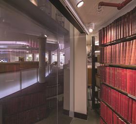
This process of camouflage is a necessary pre-requisite of conservation and also characterises Harris’ own work, his scagligola columns conceal a steel frame and several apparently solid walls throughout the building contain air plenums and services ducts. The irony of restoration is that in order to be successful it needs to be invisible. But attaining that invisibility requires an enormous amount of structural and technical ingenuity, qualities evident in the library’s radically reconfigured structure. The new vertical core and reception rotunda may be the most obvious visual signs of the building’s renovation but their clinical detachment lacks the warmth and character of the gloriously restored historic interiors. It is these rejuventated spaces as well as the quiet and concealed reinvention of the building’s structure that have genuinely given this fine historic landmark a new lease of life.


Building has been following the progress of Manchester Central Library’s use of BIM since 2011. A third instalment of the series will feature in Building soon. You can read the previous articles online here.
Book now for the BIM Show Live event, on 23-24 April, Manchester.
Project team
Client Manchester City Council
Architect Ryder
Contractor Laing O’Rourke
Project manager Mace
Structural engineer URS
M&E engineer BDP
M&E contactor NG Bailey
QS Davis Langdon








No comments yet