Make Architects’ Hiscox Building in York is a triumphant fusion of heritage and modernity that has at its heart a spectacular foyer of swirling concrete staircases and balconies - oh, and a rocket from the former Soviet arsenal. Photography by Make Architects
Designing new buildings in old cities is one of the perennial theoretical challenges of modern urban development. In Britain, three ancient cities have emerged as representative of three different approaches to heritage conservation in historic cores. At one extreme, Bath is virtually sacrosanct with assiduously enforced protection for its historic core imposing tough stylistic and aesthetic constraints that all new architecture, with mixed results, must abide by.
The City of London operates at the other end of the scale, with its historic character recklessly squandered by an indolent planning system that has triggered an architectural free-for-all chiefly distinguished by its crude and largely unsuccessful attempt to pit skyscrapers against spires.
While York is undoubtedly closer to the Bath model, it operates somewhere in the middle of the scale. Unlike Bath, York is not the result of a single urban vision and despite its popular perception as a medieval city, has carefully and incrementally evolved over time.
And it is this historic pattern that has formed the chief inspiration behind one of York’s newest buildings. The Hiscox Building is the global specialist insurer’s biggest UK office outside London. It is also the first building Hiscox has had designed specifically for it and this approach, unlike a speculative office block, has allowed architect Make the opportunity to explore the Victorian mercantile tradition of architecture as a direct expression of corporate identity.
The four-storey 4,432m² block sits on the eastern edge of York city centre and even before construction began the architect was able to turn the site into a smart commercial investment, as Make partner Jason Parker explains. “Hiscox initially purchased much of the land around the new building for their new HQ but we were able to meet their requirements in a building that occupied only half the site. The other half of the site is now being developed as a hotel as part of a local regeneration plan. Crucially we were able to insert a new public footpath between the two which now links Hiscox to a north-south pedestrian route across the city.”
City wall
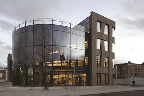
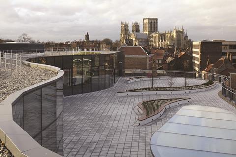
Three facades of the roughly rectilinear building are finished in brickwork with the fourth side that faces the public footpath clad in a continuous curtain wall. The curtain wall encloses a large full-height foyer the opposite side of which is framed by a curving wall of internal concrete stairs and balconies.
This arrangement is based on an architectural concept that is deeply embedded in the history of the city. York’s medieval city walls extend around much of the city but historically there was always a large gap where the River Foss crossed the city walls, the spot where the new Hiscox building is located. The reason for the gap was a stretch of water known in medieval times as the King’s Fishpool, a grand name for a Norman dam which, over the centuries, was reduced to little more than a swamp.
“The building is conceived as a continuation of the city walls,” explains Parker. “The wall of concrete balconies and stairs on one side of the atrium is a contemporary, conceptual reinterpretation of the original Roman wall that was interrupted at this site. This is the reason why the foyer is enclosed in glass, the wall becomes visible from the outside.”
Like refilling the moat in the Tower of London or adding a central spire to Westminster Abbey, the notion of contemporary projects completing abandoned and unfinished historic ones carries with it a certain romantic allure. The fact that on this occasion the “wall” is conceptual rather than literal and has also been incorporated onto a building with an entirely different function makes it all the smarter.
However, the concession made to render the internal “wall” visible externally, the glass curtain wall wrap, is problematic. Curtain walls are not a common typology within York’s streetscape, a precedent which both planners and architect acknowledged. This is not in itself a problem - what is is its incongruous visual impact, particularly in relation to the gabled silhouette of the adjacent 15th century half-timber Black Swan pub. The darkened limousine tint to the glazing visible in most daylight conditions doesn’t help either.
Nor does the fact that as with most glass facades when viewed from a reasonable distance, it is visually impenetrable, an obvious characteristic that has nonetheless failed to discourage generations of architects from consistently claiming that glass makes their buildings “transparent”.
Of course at night the situation is reversed. It is then that the concept finally comes into its own and the internal “wall”, emblazoned by the warm artificial glow of internal foyer lighting, bursts onto the townscape as the sweeping contemporary conduit it was originally intended to be.
Brickwork
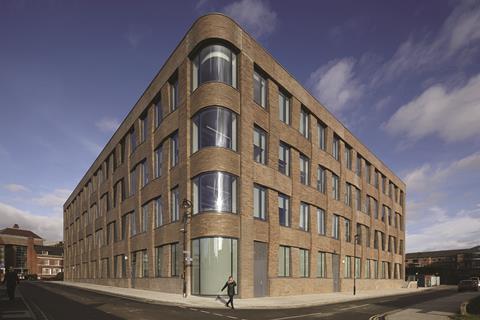
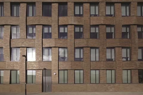
While the curtain wall may yield mixed results, the brickwork in which the remainder of the exterior is clad is superb. The facades to the south, east and west of the building are expressed as a sumptuous brickwork weave spun around punched windows, with the surfaces either rippling away or towards the window openings (both horizontally and vertically) like giant, overlocking, masonry needlepoint.
The bricks themselves are narrow slips finished with a subtle glaze that provides a hard, semi-industrial sheen that adds strength to the facades. Corners are treated with swooping curves applied to both glazing and brickwork, indulgences that add further depth and interest to elevations already richly articulated by deep recesses and confident massing.
“The weave pays homage to a former hay and wool market that was located on the site until the 1920s,” says Parker. “Its solidity also protects the south facade, along which the internal cores which are located behind it, from solar glare.”
The brick facades are a triumphant fusion of heritage and modernity. While their patchwork configuration recalls the sculpted motion of early Dutch modernism, their muscularity and scale is also indebted to the best post-war commercial buildings such as London’s Bracken House. But in their historic connection to the site and in the architect’s wise rejection of York stone which, in this city carries specifically religious connotations, the facades are a predominantly and irrefutably Yorkist gesture.
Foyer
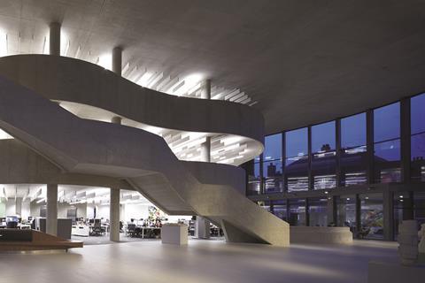
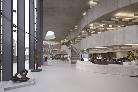
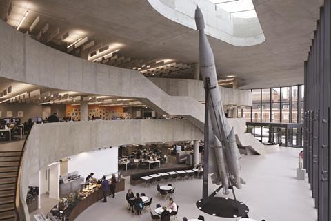
They also set the scene perfectly for the building’s most stunning feature, its spectacular foyer. The foyer assumes the full length of the building to the north end, with the glass curtain wall to one side of it and the aforesaid contemporary “wall” to the other. Between the two is a soaring, three-storey cathedral-like space, awash with natural daylight and cast almost entirely in rich, fair-faced concrete expertly smoothed and honed to almost resemble stone.
Refreshingly, there is some decidedly non-corporate interest too. To the far end, a rocket appears surreally primed to be blasted into a skylight above it. Despite appearances to the contrary, the skylight came first and the rocket, a weapon-turned-sculpture that is an authentic Cold War remnant from the former Soviet arsenal, is now part of former chairman Robert Hiscox’s impressive art collection.
But the real star of the show is the spectacular, swirling concrete ribbon of staircases and balconies that form the conceptual wall that frames the southern side of the foyer. Straddled by two prancing staircases trimmed with decadent leather handrails that twist and curve around the bulging swell of the balconies, it has a dynamic verve and operatic motion that immediately renders it both elegantly voluptuous and spatially immersive. This is no cold corporate cavern; this conceptual resurrection of York’s historic wall has been unexpectedly transformed into a truly stunning and emotive piece of contemporary architecture.
While it is both impossible and unnecessary to maintain the drama of the foyer throughout the remainder of the building, office areas are marked by the transparency and openness that was also a key aspect of the architectural concept. Workspaces are arranged in open-plan offices areas that look out directly onto the foyer and a generous roof terrace above the foyer provides spectacular views of York Minster and the city skyline.
But it is undeniably the foyer and the brickwork that are the most memorable aspects of the building and the contemporary elements that anchor the scheme so successfully into York’s historic context. So much so that it becomes irresistible to compare Hiscox with some of the same architect’s other work. It is almost impossible to reconcile the charged creativity and contextual sensitivity with which the architect has handled its historic brief here with, for instance, Make’s other recent office building in another ancient commercial core, 5 Broadgate in the City of London, whose scale, materiality and massing is grotesquely at odds with context.
Is it a case that York’s planners, unfamiliar as they are with the intricacies of curtain wall glazing, are more adept at extracting contextual responsibility from architects than their supposedly urbane contemporaries at the City of London? Or is Make simply a practice with a chameleon-like ability to summon architectural shape-shifting in order to satisfy client demands? Only client, planner and architect will ever truly know. But one thing is certain, nestling up Make’s sleeve is that most rare and elusive of architectural elements: surprise.
Project Team
Client Hiscox
Architect Make
Main contractor Bam Construct
Structural engineer Arup
M&E consultant Bam Services Engineering
QS Gleeds
Interior design KKS Strategy






No comments yet