In its renovation of west London’s Bush Theatre, Haworth Tompkins was asked to make the building and the theatre it contains accessible and approachable to all the local community. The result, says Ike Ijeh, is full of twists and turns
It is easy to think of architecture as capturing a single moment in time. A project completes, the design team moves on to other work and there you have it: a snapshot of effort and collaboration, frozen in time. But of course buildings, like people, don’t just stand still. They evolve, change and grow over time – long after snagging completes and builders down tools.
Which is why Haworth Tompkins’ new Bush Theatre in west London offers such a fascinating discourse in how elongated and immersive architectural intervention really can be. The practice has just finished a £4.5m renovation project for the theatre six years after it originally converted a former library into the theatre’s previous accommodation.
The Passmore Edwards Public Library in Shepherd’s Bush was built by architect Maurice Bingham Adams in 1895 in the florid, late-Victorian arts and crafts style that has become so synonymous with late 19th-century civic buildings. An extension was added in the 1950s.
But when, in 2008, the gargantuan Westfield shopping centre opened in the area, as part of its Section 106 agreement a new Shepherd’s Bush Library was built at a site nearby. The old library closed and fell into disuse, a process only arrested in 2011, when Bush Theatre relocated from its original premises above a nearby shop and moved into the building.
At that time Haworth Tompkins was appointed to design the renovation. This it did on a shoestring budget, creating a 150-seat auditorium in the 1950s extension and converting former reading rooms and administrative offices into sparsely appointed front- and back-of-house spaces respectively.
“It was based on the Edinburgh model,” observes practice co-founder Steve Tompkins ruefully, in reference to the impromptu theatrical colonisation of space that takes place in the city during its famous festival. “We provided the basic accommodation and facilities for the theatre to run but it was done without a great deal of money.”
And today the practice has come back to the theatre almost six years later to complete a far more extensive renovation project that, for the first time, transforms the building into a theatre in its own right, rather than an auditorium within a converted library. Construction began in April 2016 and the theatre reopened this month. Ostensibly the project provided an opportunity for the architect to return to its previous work. But it also offers a chance to see how the design process can benefit from that precious quality: hindsight.
Brief
Jon Gilchrist, the Bush Theatre’s executive director, explains some of the problems found in the building prior to redevelopment, that prompted the most recent overhaul. “We needed to improve accessibility – for instance, we had no lift access to the first and second floors. Sustainability was poor and the building was energy inefficient and expensive to run. We also needed to rationalise the space and make the layout and circulation flow better.”
But for Gilchrist and the rest of the theatre management, there was one further key issue that they were desperate to address. “The theatre is located at a social and economic crossroads. Within this same neighbourhood you have astounding wealth but you also have examples of extreme social deprivation. Shepherd’s Bush is an incredibly rich and multicultural part of London. We’re right next to Shepherd’s Bush Market and we sit on the Uxbridge Road, which allegedly has more languages spoken along it than any other street in Europe.
“And yet if you’d asked most local people what this building was they’d still say it was the old library. So first and foremost we want this to be a facility that is inclusive and open to the whole community and reflects its diverse, multicultural identity.
“This building was originally built for the democratisation of literature and we want to bring that same process to the theatre. The challenge for our theatre and for so many theatres generally isn’t price, it’s perception.”
And accordingly, one of the first and most visible architectural interventions is engaged in changing this perception. Although unlisted, externally the building is largely unchanged and its late-Victorian character is retained intact. However, there is one significant external change, a continuous new single-storey canopy structure built along its western facade, perpendicular to the main Uxbridge Road frontage.
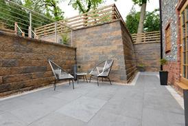
This forms the new entrance to the theatre and opens out onto a narrow landscaped terrace strip and directly onto Uxbridge Road. The canopy is enclosed by a continuous series of glass sliding doors that can be fully opened when the weather permits, allowing patrons to spill out on to cafe seating within the new terrace beyond.
Trimmed with black painted corrugated metal along its roof and starkly encased in black, glazed ceramic brickwork at its far end, this extension marks a casual footnote to the formal authoritarianism of the original building and makes no real effort to engage in a stylistic dialogue with its forbear. But nor does it need to – to all intents and purposes the canopy is expressed as a combined unit with the terrace, and together they form a near-autonomous composition that acts as an effective new entrance to the venue.
Moreover, Tompkins speaks of physically interpreting Gilchrist’s desire for a more accessible and community-facing venue by creating a “thin membrane between the life of the street and the theatre” and this is what canopy and terrace combined achieve.
Interiors
But what is equally important is how this inclusivity is fostered internally. Tompkins talks of “improving capacity, fluidity and adaptability for the future but in a way that keeps the intimate and informal quality of the interiors”. This ambition quickly becomes apparent in series of almost domestically appointed rooms that form the front of house.
Original walls are smashed through – their sawn-off internal brickwork left almost indecently exposed – to create an enfilade in which sits a new zinc-trimmed bar, a reading room and an enlarged foyer space from which toilets, the main auditorium and back-of-house spaces are reached.
The auditorium itself is little changed, although greater flexibility has been introduced into the seating arrangements and capacity increased to 200. Already located in the 1950s extension, it has now been joined in the new block by a workshop, dressing rooms and studio that dramatically expands the venue’s performance repertoire.
A lift provides disabled access across the building’s three floors for the first time. The first floor contains simply refurbished office spaces as well as a tiny writer’s room. With its Lilliputian dormers and exposed rough plaster on its main wall, this accidental space has all the nostalgic charm of a Dickensian garret. It also represents an inspired re-appropriation, one of a series of “found spaces” Tompkins reveals were discovered across the building.
Above this on the second floor a remarkable new rehearsal studio has been created. Realised by the removal of partition walls, the studio is a now a continuous attic room sitting underneath the pitched roof and punctuated by jutting dormers. Its swooping angularity gives it character enough but the uniform addition of acoustic OSB board to its walls and ceiling adds a vaudevillian gaiety set within the imagery of a rustic barn.
Approach
Tompkins reveals that the project provided few structural challenges as both the Victorian pile and 1950s extension were “solid, robust and well built.” Architecturally, throughout the building and particularly on the ground floor in the front-of-house area, little attempt is made to hide the building’s former function. Spaces still retain the high ceilings, mullioned casements and ceiling covings of their previous incarnation, albeit now bedecked with an assortment of colours and fabrics by local artist Antoni Malinowski.
The approach recalls Haworth Tompkins’ previous theatre work at the Everyman Liverpool, Chichester Festival Theatre and London’s National Theatre. In all these instances the success of the new design was in its ability to carve a response that is so attuned to the rhythm and tone of the original fabric as to appear invisible. While the cosmetic flourishes mean that the process is not quite so seamlessly deployed here, it is still clearly in evidence and the scheme is all the better for it.
As Tompkins himself explains: “We didn’t want to be nostalgic or overly sentimental; the job of the building is to ensure that it satisfies its current needs. But we also didn’t want to sweep away history; we wanted to understand the character and eccentricities of the building, so we do just enough to enable the theatre to grow into the space.
“In this way, although it’s a very different and much smaller project than the National Theatre, for instance, it’s still engaged in the same process of understanding how you make a cultural institution work and providing more openness in a way that stays true to the original fabric.”
But there are two other considerations that infuse this signature Haworth Tompkins doctrine with a renewed urgency here. The first is the ambition to make the building more culturally and socially accessible, an objective which particularly endeared Tompkins.
“The idea of a new ‘found space’ for the cognoscenti might be great for them but it doesn’t work for the locals – we wanted to appeal to both. This also runs in tandem with what we were trying to do at the National; it’s about making culture more inclusive and ensuring that it’s not just the privileged that go there.”
And the second consideration is the cumulative impact of coming back to a project after five years, an opportunity Tompkins insists brings only benefits. “It gave us the opportunity to come back and really understand how the building was working. It ensures that the architect’s ego isn’t the main player in the room but instead pushes us down the route of careful thought and analysis over the long term. That’s a rare position to be in on a project but it was the real joy of this one.”
Project Team
Client Bush Theatre
Architect Haworth Tompkins
Main contractor Rise Contracts
Structural engineer Momentum Engineering
Service engineer Skelly & Couch
Quantity surveyor Bristow Johnson
Acoustic engineer Paul Gillieron Acoustic
Project manager Plann
No comments yet