As custodian of millions of precious books and manuscripts, Oxford’s Bodleian library needed a much bigger - and safer - building to house its collection. With the new Weston Library, Wilkinson Eyre provided this and much more
Home to more than 11 million books and manuscripts, the Bodleian in Oxford is one of the world’s most important libraries. Among the artefacts to be found in the UK’s second-largest collection - after the British Library - are a quarter of the world’s original copies of the Magna Carta, the private papers of six British prime ministers, a Gutenberg Bible, the earliest surviving book written entirely in English and almost 10,000 western medieval and renaissance manuscripts.
Founded in 1602, the University of Oxford’s world-famous Bodleian Library is one of the oldest in Europe. It is also a copyright library - one of only six depositories in the country that is sent copies of all books published in the UK and, latterly, Ireland. And as such, one logistical feature has defined the Bodleian’s long history: expansion.
Its latest cycle of expansion has just been completed by architect Wilkinson Eyre. Its extensive £80m renovation programme has refurbished what was formerly called the New Bodleian Library but will now be known as the Weston Library.
The grade II-listed building was completed by Giles Gilbert Scott in the thirties and is part of an extraordinary complex of iconic Oxford university buildings whose evolution both attests to the Bodleian’s rampant expansion over the centuries and represents a constellation of works by some of the UK’s most stellar architects.
The Bodleian’s oldest original buildings still date from the 17th century and are arranged around a scholarly Jacobean quad to the south of the Scott buildings. By the Victorian era the library had expanded sufficiently to acquire two key adjacent 18th-century buildings. First it occupied the ornate rotunda of James Gibbs’ Radcliffe Camera, a sumptuous, domed fusion of baroque and Palladian.
Then as recently as 1975 it also acquired Nicholas Hawksmoor’s stunning baroque Clarendon Building, directly opposite Scott’s wing. All four buildings linger in the shadow of Wren’s Sheldonian Theatre, only his second commissioned work.
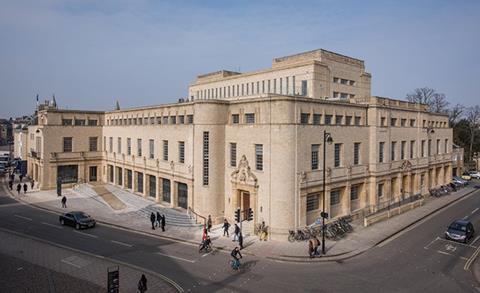
But it was the construction of Scott’s New Bodleian Library in the thirties that represented the biggest purpose-built expansion of the library. Dressed in Scott’s signature garb of streamlined, traditionally inspired modernism, the building presented a handsomely magisterial exterior to vie with its esteemed neighbours. It also concealed its massive 11-storey central block by a clever series of receding facades that enabled it to relate to the scale of lower, surrounding historic buildings.
But problems lingered inside and they centred on two key areas: structure and environment. Structurally the building is essentially divided into two segments, a lower, concrete frame perimeter block, which encircles the central 11-storey steel frame block.
The central block was where all the books were stored but its unprotected steel frame, comprising thousands of slender exposed steel columns and thin floor slab sections, meant that any fire could have caused catastrophic damage to the building and potentially destroyed one of civilisation’s greatest book collections.
The second key problem centred on the environmental conditions in which the books were kept. These did not even begin to approach the onerous specifications demanded by BS 5454, the notoriously exacting environmental standards for the storage of archive material. As such, the Bodleian’s treasures were not only at risk from fire but from environmental damage, too.
For Wilkinson Eyre associate director Geoff Turner, these challenges formed the starting point of the practice’s competition-winning design. “This project is one born out of technical problems,” he explains, “but we also extended the brief to address two other key areas.
“We wanted to improve the residential facilities the library offered to its users, which enabled us to address existing issues to do with entrance and access. And we also wanted to provide a means to get the library’s collection out on display to the public.” These two ambitions went on to define the entire scheme.
Structure
That scheme was centred on a core structural solution. The fabric of the perimeter wing has been extensively upgraded with stonework cleaned and interiors reconfigured and restored. But the 11-storey central book stack has been entirely demolished and rebuilt as a modern concrete frame that fully complies with BS 5454 and provides four-hour fire protection for the library’s priceless collection.
In the tradition of Wilkinson Eyre’s work, the innovative structural solution devised for the rebuilding of the central stack provides new opportunities for vigorous architectural expression. The stack has been replaced by two concrete cores built on either side of the resulting void. A new “floating” stack has then been inserted between the cores with a gap maintained between the new stack and surrounding perimeter block on all four sides. The stack is then raised two storeys from the ground to create a new double-height entrance hall underneath.
It is also pulled away from the entrance facade to create a full-height entrance atrium. All services have also been stripped out and replaced; Turner reveals that 100 tonnes of asbestos alone were removed from the building.
This structural approach essentially called for the demolition of one building inside another and the resulting technical complexities were enormous, as Turner explains. “We couldn’t demolish the central stack because of the level of vibration this would expose the surrounding building to. So we had to dismantle it floor by floor, painstakingly cutting away steelwork and concrete. Just removing the stack alone took a whole year.”
Moreover, matters were complicated by the fact that the library also contains three basement floors that also could not be demolished. Therefore, the old stack had to be removed while maintaining the structural integrity of the levels underneath. Also, as these original levels were remaining in place they had to be upgraded to BS 5454, a process which Turner describes as enormously challenging.
“We had to encase thousands of steel columns in concrete. In many ways what happened in the basement determined the entire scheme, so we had to go through a tortuous process of getting it absolutely right. We also had to ensure that all levels of intricate detail and technical specifications for the basement were fixed at planning stage. In a site as historically sensitive as this it would have been impossible to significantly change the design above ground - after planning has been secured - as a result of any structural variation imposed by the basement. So, unusually, the level of detail the drawings included at RIBA Stage D, the planning submission drawings, is essentially what was built.”
Design
Externally Scott’s building from street level looks largely as it did before, except in two areas. First the stonework, a warm, richly textured hue of local sand-coloured limestones, has been lovingly cleaned and restored, as has been the case on several original interiors too.
The second external change is more radical. Directly opposite the Clarendon Building, Scott introduced a blind colonnade, a procession of pilasters set against the ground floor wall. These were set back behind a large but formerly inaccessible raised plinth placed between the building and the street.
By hacking the plinth away, a new small entrance piazza has been introduced complete with steps and ramps. For the first time, this enables Scott’s building skilfully and spatially to interact with the various axes and vistas that emanate from the surrounding historic buildings and converge on the new Weston Library. This is particularly the case with the principal formal vista that sweeps through the Clarendon Building to the central quad of the Old Bodleian Library beyond.
Significantly, the new library entrance has been placed behind the sweep of pilasters, behind which a genuine recessed colonnade has been inserted for the first time, a clever reconfiguration of what was formerly a blank wall that firmly embeds Scott’s building into the collegiate architectural language of enclosed courtyards and walkways that is synonymous with Oxford.
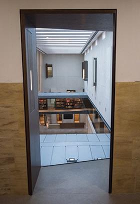
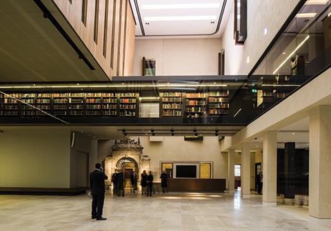
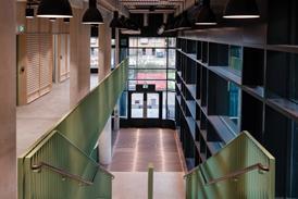
But it is what lies beyond the colonnade, inside the building, that reveals the true extent of the new architecture, and embeds the Weston even more firmly into its context. The new entrance foyer is a dynamically uplifting space, a powerful, foursquare void cast deep into the heart of the building that ingeniously combines the quiet rectitude of an Oxford quad with the kinetic drama of new structure inserted into old.
Unlike the cacophonous clamour of balconies and circulation we may commonly associate with atriums in a commercial or retail setting, here it’s not what’s inside the hall but what’s around it that counts, and also the intelligence and subtlety with which these perimeter elements are integrated and expressed.
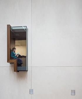
Above the hall hangs the new “floating” stack with its frontage lined in vertical strips of lightly stained timber, its colour quietly but not overtly reminiscent of exterior and interior stonework. Around it on first floor level lies a continuous glass gallery in which the brightly coloured spines of the books are proudly displayed like jewels in a case - a visual motif directly inspired by SOM’s seminal 1963 Beinecke Library at Yale.
Beyond the hall lie the new exhibition galleries that will enable the Bodleian to show its treasures to the public for the first time. And all around it a narrow gap has been inserted between the central floating stack and the surrounding original perimeter block to suggest a supple tension between new and old.
The gap condition is most powerfully expressed to the front of the hall where the floating stack is pulled away from the entrance facade to reveal a soaring 14m-high space surmounted by new skylight strips - in the manner of Scott’s original windows throughout the building - cut into the roof to flood the hall with light.
The visual characteristics established in the hall are prevalent throughout the remaining new areas of the building. The top floor reading room and visiting scholar rooms both display the repetitious linearity evident in Scott’s original work and the new entrance hall. This is often expressed by continuous window strips, their reveals gently splayed to admit more light, or the streamlined fixtures installed on new reading desks and furniture, which Wilkinson Eyre have also designed.
Other original interiors have been beautifully restored, such as a masterly sequence of first floor reading rooms alternately surmounted by elaborate plaster and timber ceilings. There is also a spectacular new rooftop terrace, created by the removal of an obstreperous sixties attic extension, which now offers stunning views over Oxford’s spired skyline.
But it is the entrance hall to which we must return to encapsulate the new building’s true architectural spirit. With surprising honesty, Turner admits that “at the very start of the project, such was the scale of technical challenges presented by the original fabric and particularly the basement, that the architectural vision was almost secondary.”
Were the Weston Library a bad building, such a position would be unforgivable, however successfully the technical challenges had been resolved. Yet the new library stands as a building of astute technical and aesthetic artistry, whose core “floating” stack concept combined with its surrounding perimeter void creates a whole series of visual and spatial encounters throughout the building that galvanises the relationship between old and new.
Therefore the new Weston Library not only renews an ancient institution for future generations. It also stands alongside projects such as the Mary Rose and Singapore’s Gardens by the Bay, as testament of Wilkinson’s Eyre’s remarkable ability to channel architectural spectacle from engineering prowess.

Project Team
Architect Wilkinson Eyre
Client University of Oxford
Structural engineer Pell Frischmann
M&E consultant Hurley Palmer Flatt
QS EC Harris
Main contractor Mace






No comments yet