While many brutalist schools are being knocked down, one in south London is making a virtue of its architectural heritage and converting into housing. Photographs by Edmund Sumner
Brutalism is undoubtedly experiencing something of a renaissance. While concrete fly towers are never likely to enjoy the communal cultural adulation heaped on Georgian sash windows, a process of revisionism has rendered a style once derided as caustic and inhumane as much more socially acceptable.
However, while the threat of demolition has abated for many brutalist buildings, it has never really gone away, as the rubble of Northampton’s Greyfriars Bus Station, Birmingham Central library, the Tricorn Centre and Gateshead’s Trinity Square car park violently attests.
Moreover, as the demolition of Pimlico School in 2010 famously proved, brutalist schools are particularly vulnerable to demolition, their combination of authoritarian design and woeful thermal performance being largely incompatible with the limited budgets and less hierarchical teaching culture generally prevalent in the education sector today.
However, one former school in south London has bucked this trend in three significant ways. First, it has avoided demolition. Second, it has rejected the refurbishment route recently adopted by other brutalist schools such as Haggerston School and Stoke Newington School in east London. And third, it has undergone a unique transformation that virtually never happens to brutalist schools: it has been converted into housing.
Lilian Baylis School in Lambeth closed in 2005, three years after it had been awarded grade II listed status. Years of dereliction and decay ensued until the site was bought by Henley Homes in 2011. Today, it has been transformed into a new residential development offering 149 new homes, 40% of them affordable.
The architect behind the radical conversion is Conran & Partners. The practice is currently engaged in another significantly more high profile residential conversion, the transformation of central London’s notorious Centre Point tower into flats. And here, as at Centre Point, the new designs have sought to revel in the retro 1960s modernism that informed the original scheme.
This approach is in marked contrast to the design strategy likely to have been adopted had Lilian Baylis been refurbished as a school. Certainly the experience of Haggerston and Stoke Newington schools suggests that for brutalism to be palatable in a modern school environment its innate character must be sanitised and repressed. What is now known as Baylis Old School has done the opposite, a tactic that has been validated by its winning a 2016 Housing Design Award last month.
Brutalist-lite
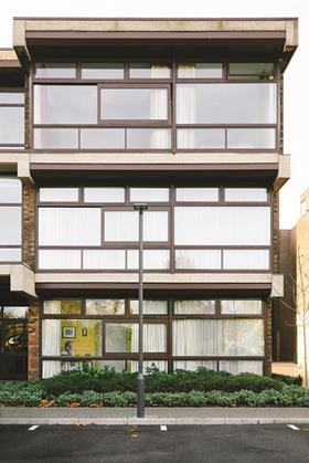
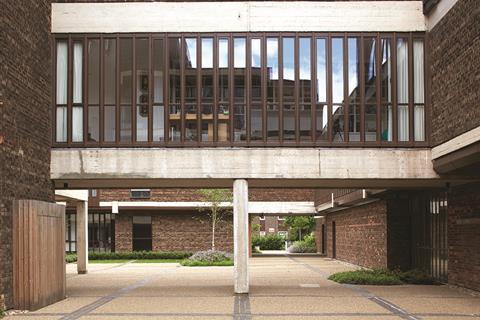
The original Lilian Baylis School was completed in 1964 and designed by the Architects’ Co-Partnership (ACP) for GLA forerunner the London County Council. It was never an essay in the kind of steroidal brutalism that elsewhere produced cliffs of concrete. This was more a brutalist-lite affair with sedate two and three-storey brickwork blocks with concrete restricted to exposed floor-plate spandrels, beams, columns and soffits arranged around large window openings. Even this regimentation was occasionally broken by facades that featured vertical narrow window openings, which enclosed the circulation corridors that once served the classrooms.
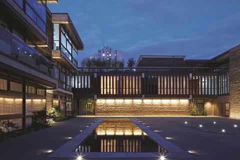
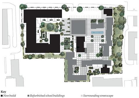
The school was marked by another humanising architectural feature that separated it from its more aggressive contemporaries. It was arranged around an extraordinary series of interconnected courtyards, all of which here navigated through a variety of openings and routes and which also maintained differing scales and characters. This courtyard composition was specifically referred to in the 2003 listing citation and has formed a key part of Conran’s conversion concept.
Conran & Partners partner Lee Davies describes the new architectural approach as one that “sought to understand the original buildings, retain exposed structural elements and draw upon the drama of the plan form and its linked courtyard spaces.” In this strategy the design team found itself in the unique but enviable position of being assisted by Bob Sealy, the ACP project architect for the original school.
Davies reveals that Sealy was “enthusiastic” about the conversion, possibly not least because it guaranteed that the formerly disused building would avoid the demolition fate so savagely conferred on Pimlico. Moreover, Sealy apparently viewed the new scheme as a chance to “implement some of the original features that were never realised in the 1960s masterplan.”
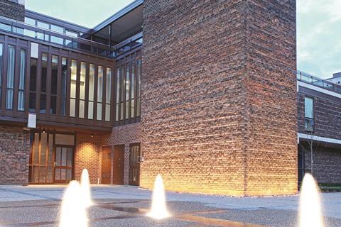
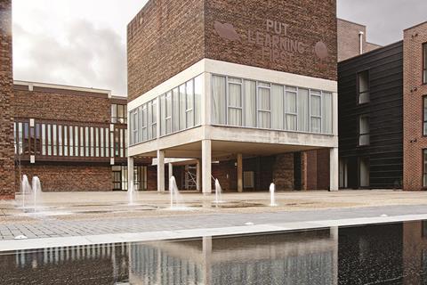
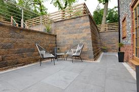
The first of these is evident when first entering the new development. The entrance leads to the main square at the heart of the old school, a former playground now transformed into an expansive residential forecourt. A grade-level reflecting pool has been installed, envisaged when the school was originally designed but never built. The pool perfectly sets the tone for the kind of spatial character sought by the new scheme. Water is always tremendously humanising and here it subtly helps signify the kind of intimacy, tranquillity and calm that characterises the new development.
The centrepiece of the former school was the library to the middle of the new square and the stair tower beside it. These remain the tallest elements of the development and have been reconfigured as a “pin-wheel” around which a succession of interconnected residential courtyards radiate. Moving through this ribbon of spaces provides a dramatic sequence which undoubtedly forms the architectural highlight of the scheme. They also enable the new development to offer four times the amount of amenity space than current regulations demand.
Breaking uniformity
Much of the spatial excitement generated by the courtyards is due to the original design but it is also a consequence of the architectural and landscaping treatment adopted by the new interventions. Each courtyard already differed in scale, and composition was ultimately unified by the institutional homogeneity the school’s single function demanded. The breaking of this uniformity is central to the diversity of character the new scheme has established and the strength of the new architectural identity it seeks to establish with its revised use.
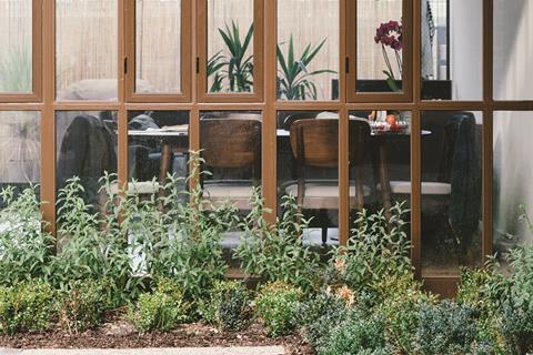
This uniformity is broken in a number of clever ways. ACP’s original grid-like paving pattern has been retained, but the slabs are occasionally replaced by shrubs or greenery that help weave a softer pattern of surfaces and edges throughout the site. Where ground-floor classrooms once presented a hard edge to the courtyards, soft landscaping has also been deployed subtly to demarcate the private space of the new residential units beyond.
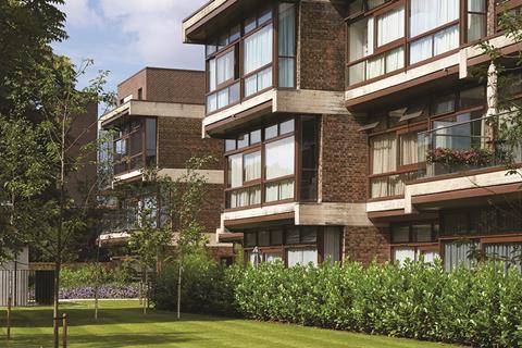
Quiet changes have been introduced elevationally too. The overall architectural language of the facades has been retained so the courtyards are still faced by brick wings punctuated by horizontal concrete channels and large window openings. But occasionally, where a concrete channel extends significantly from the face of the building behind it, a balcony has been seamlessly inserted with the former classroom cill level dropped where necessary to accommodate the floor-to-ceiling glazing capable of providing access.
Equally, to prevent cold bridging between the external exposed concrete elements and the interiors, additional boxed insulation channels have been subtly inserted underneath the horizontal concrete, altering the elevations but in a way that is in keeping with their original spirit.
Flats
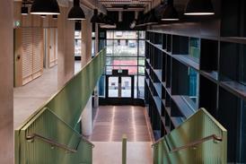
The flats themselves are accessed by staircase cores which serve up to four properties per floor. Most of these staircase cores were part of the school’s original circulation layout and therefore the new plan was largely able to avoid the installation of communal access corridors. The retained staircases are often svelte sculptural pieces in themselves, forming elegantly curving concrete pirouettes that embellish the minimalist retro chic that is suggested on the exteriors.
Retro goes into overdrive in the flats themselves, whose conversion from former classrooms is so convincing as to make the flats seem as if they were part of the original design. Because of the former institutional composition, floor-to-ceiling heights are far more generous than they would normally be for residential, and the floorplans have been cleverly configured to provide relatively compact kitchens but maximise living areas, both of which, in keeping with nostalgic 1960s lifestyles, are open plan. There are a total of 46 flats in the school conversion and Davies jokes that such was the complexity of the new plan that virtually no two are the same.
But the chief attraction of the flat interiors and the chief source of the claims to retro chic are the windows. Thick, muscular mullions of original iroko hardwood frame expansive views onto the courtyard, providing a level of visual connectivity with the dynamic outside spaces that belies planners’ habitual obsession with overlooking.
Davies reveals that the windows are original, merely upgraded from their woefully underperforming single glazing to double glazing. With their dark staining and floor-to-ceiling height, they are happily reminiscent of the Barbican’s interiors and add a florid vintage virility and charisma to both the interiors and the elevations.
Newbuild
Most of the development’s 149 homes and all of its affordable units are provided in new-build wings built next to the converted school. Despite the dynamism of the courtyard composition, like most 1960s brutalist public buildings, including the Barbican for that matter, the former school was pathologically inward looking and largely shunned the street. As Davies explains, the new design seeks to rectify this introversion by “introducing buildings to the perimeter of the site that provide stronger definition to the street edge and help animate the streetscape”.
This goal is achieved by a combination of three-storey townhouses which compliment a neat Victorian terrace opposite and larger flat blocks. Both are subtly influenced by the architecture of the former school with the new brickwork, proportionality and the language of horizontal channels supporting balconies all showing evidence of conceptual alignment with the 1960s blocks.
The new-builds are passable architecturally and equip themselves well with regard to tenure blindness and contextual integration. But the real star of the show undoubtedly remains the converted school. The success of the conversion was doubtless helped by the fact that Lilian Baylis was of the brutalist-lite variety; one suspects that converting a school as ideologically intransigent as Pimlico into housing would have presented a considerably more taxing challenge. Additionally, in the immersive sequence of courtyards, the new architect was already given a building of considerable spatial quality to work with.
Notwithstanding these circumstances, the new scheme undoubtedly marks an inspired stylistic reinterpretation of a faded period building and takes every opportunity imaginatively to exploit and enhance original features for maximum charismatic affect. The current hipster phenomenon proves how irritating attempts at retro chic can be when forced. But here any allusions to 1960s modishness are not simply the result of a superficially imposed cultural programme but flow from an architectural strategy driven by a thorough understanding of the personality of the original building. It works because, despite appearances, this has much more to do with conservation than chic.
Hence we see the retention of school-related signage in the main courtyard such as “Put Learning First”, an inclusion that might have seemed contrived were it not for the wider efforts made to stay true to the institutional origins of the original building. So much so that ironically, one imagines that if Sealy and co had sought to design a residential building on this site back in 1964, it might not have looked all that different to what has been created now.
Project Team
Architect Conran & Partners
Client Henley Homes
Main contractor Henley Homes
Structural engineer Lyons O’Neill
M&E engineer Mendick Waring
Project manager Henley Homes






No comments yet