OMA’s first science building, Lab City engineering school near Paris, humanises its rational grid structure through a system of streets and squares bathed in natural light.
This week a radical new kind of engineering school is set to open in France. Lab City has been designed by renowned Dutch practice OMA, headed by architect Rem Koolhaas, and it is the practice’s first science building.
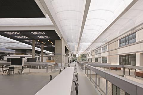
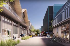
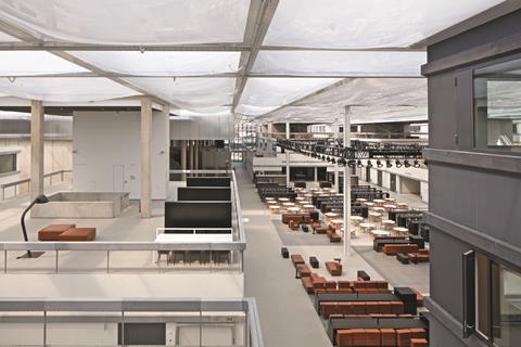
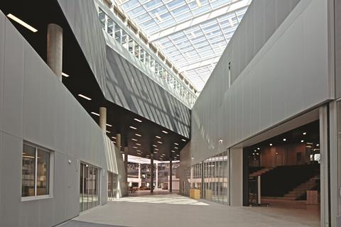
But what is unique about it is that it is actually around two dozen buildings linked by a vast ETFE roof to essentially form one giant superstructure. Buildings are structurally and environmentally independent and the spaces between them which the roof covers are conceived as naturally lit and ventilated “streets” slicing through a city.
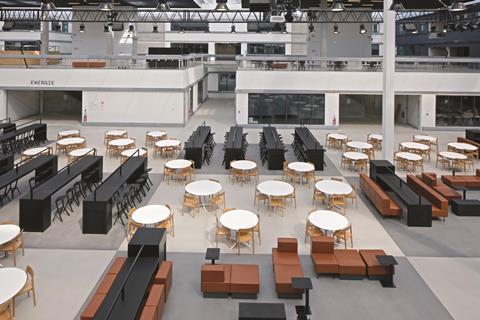
Lab City is therefore a term that can be taken quite literally; the individual buildings house the laboratories and the spaces between them provide circulation and offer more communal functions such as study, dining and recreational spaces. As OMA partner Ellen van Loon puts it: “It’s about objective and subjective spaces. The laboratories are the objective, enclosed spaces that respond to the very precise technical and engineering requirements that science demands. But the streets are the subjective, they are common active spaces bathed in natural light where an infinite number of varying programmes can take place.”
This radical approach to an education building is rooted in the architectural response to the client’s intention of providing greater unity and interaction between a number of different college faculties and facilities that were formerly housed over a disparate site, as van Loon explains:
“It’s about unifying the entire school – previously it was a series of separate, disparate blocks with virtually no physical or social connection between them. Now the division between laboratory and non-laboratory spaces is maintained but within an overall architectural programme that encourages interaction and activity.”

But the unusual consolidation of several buildings into one set a number of unique design challenges which are addressed with varying degrees of success throughout the project.
Lab City is part of the sprawling new 22ha Joliot-Curie university district being built in Saclay to the south-west of Paris. The district has also been masterplanned by OMA and will eventually feature work by other prominent European architects such as Renzo Piano. The university, CentraleSupélec, was formed in 2015 by a merger between two of the most prestigious engineering schools in France, and OMA’s new building is named after one of France’s greatest engineers, Gustave Ei el.
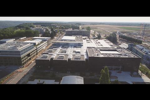
The new building is vast in scale. It is roughly square in plan and occupies an impressive footprint of 155m x 122m. This is capable of accommodating almost 5,000 students, a gure common on university campuses across Europe and the US but rarely housed in one single building. But the client identi es the ability to house so many facilities and buildings under one roof one as one of the key advantages of its superblock format.
The architectural concept behind this format, as one might expect, is based on an entity that sits well within an engineering concept, a grid. Once the overall grid footprint had been determined, the architect broke it down into individual blocks measuring around 22m x 17m to form a giant chequerboard. The grid was then further fragmented by blocks being removed from the centre to form a vast central square.
Next, a huge diagonal swathe was cut right through the grid, further removing or chamfering individual blocks. This now forms the building’s principal street, conceived as an uninterrupted public cut-through right through the building site that links to the principal pedestrian spine through the masterplan and is intended to serve a planned metro station that may one day be built to the north-west corner of the building.
The remaining blocks are then clustered into four zones towards each corner of the building with each one relating to an engineering school faculty that previously occupied a separate building on the college’s former site. Two of these zones are located at either end of the main diagonal street and dispense with the grid formation by being loosely con gured around doughnut-shaped courtyards.
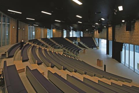
One of these zones is occupied by administrative o ces and classrooms, the other by a vast semi-circular auditorium above which a language school for foreign engineering students sits.
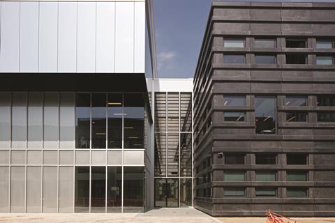
The original gridded arrangement is retained in the remaining two zones, the chequerboard pattern is unaltered in one but individual blocks are conjoined to make longer rectilinear blocks in the other. But the principle of streets subdividing buildings is maintained throughout with each street forming an entrance once it reaches the edge of the main building footprint. The full height above the entrance is lled with louvres which enable both the streets and the central square to be fully naturally ventilated. A labyrinthine network of bridges at all levels links all the individual blocks within the building together.
Project architect Edouard Pervès describes the nature of the streets and central square as “the outside being brought inside.” He also explains that the over-sailing ETFE roof also has a vital role to play in determining the quality of the street spaces below. “The quality of light admitted through the ETFE roof is always constant and di use, even on grey days. It’s also incredibly white and provides a unique quality and character to the spaces below.”
But if these individual blocks are essentially treated as independent buildings, it begs the question of why the design goes to the extreme e ort and expense of covering the spaces between them to create one superblock at all. Couldn’t the sensation of being in a street be emphasised by being in a genuine outdoor space which wouldn’t need an ETFE roof to administer daylight?
Van Loon’s comments about seeking to create unity across the campus does justify the superblock approach in terms of concept but in execution, it seems odd to mimic the feel of an outside space by internalising it. Moreover, for all their scale and the quality of light admitted from above, the streets and square do still feel like indoor spaces, albeit highly polished and often spatially dramatic ones.
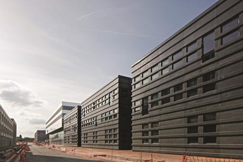
A bigger problem are the elevations. Externally, the building looks incredibly sombre, almost staid. Each internal block is externally expressed by the intervening streets being evident by the deep recesses between them. The facades are unremittingly clad in prefabricated panels of black concrete with a satin coating to ensure that the pigmentation of the concrete is retained and is not washed out over time. The only exception is the main auditorium and languages block which is clad in silver aluminium panels.
The elevations are rational, rectilinear and repetitious and while they may indeed stay true to the grid con guration at the core of the concept, they present an overly defensive and foreboding outlook that could as easily allude to militaristic precedents as the geometric ones they spring from.
But spatially, the building’s cross section delivers greater excitement internally. Upon entering the building, the potentially oppressive mass and bulk is stripped away as the blocks become lower the closer they get to the centre of the plan. As the ETFE roof is consistently maintained on the same level, the lower the blocks get the larger the roof, and amount of daylight becomes. By the time the central square is reached it is evident that in section the blocks climb in height from the middle to the building boundary allowing for the creation of staggered terraces above them.
These create a welcome level of spatial dynamism and movement to the interiors that, outside the blocks at least, break free from the rational confines of the grid and elevation and replace it with a far more dramatic internal quality of splayed geometries, over-sailing bridges and shifting vertical and horizontal planes. There is also an enormous level of transparency within with an infinite number of glass panels allowing views into labs and offices and out through to the internal street and the external city beyond.
These techniques give some character and intrigue to an interior that could all too easily have been sterilised by the monotonous continuation of the grid formation so evident in the plan and on the elevations. For van Loon, this dual approach of rationality and irregularity is a vital sequence. “The duality is important, the building doesn’t reveal itself in one go, the story changes the deeper you unravel it.”
The functional idea of a superblock, particularly with the myriad internal programmes a higher education building demands, has its obvious advantages. It allows the option of shared services, economies of scale, structural rationalisation and as is particularly the case at Lab City, it can unify a potentially disparate set of interdependent faculties.
But in emotional terms the idea of superblock is in itself not a very human idea. It can so easily appear aggressively mechanised and industrialised in scale, a cavernous warehouse that suppresses intimacy. Which is why OMA’s concept of conceiving this block as a city is so essential and, on Lab City’s interiors at least, convinces. The grid concept may reveal this as a mechanical city at its roots. But in the diversity and animation of its internal spaces and its adoption of the typology of squares and streets, it gives the efficiency of a grid a human touch.
Project team
Architect: OMA
Client: CentraleSupélec
Main contractor: Bouygues
Engineers: Bollinger + Grohmann / Alto Ingénierie / Royal Haskoning DHV
Landscape architect: D’Ici Là

This November’s Building Live conference will feature a session on Building Schools and Universities that are Fit for the Future.
To book your ticket, go to www.building-live.co.uk

Follow Ike on Twitter @ikeijehView full Profile












No comments yet