Talk about a cabinet reshuffle – Denton Corker Marshall’s flamboyant design for Manchester’s Civil Justice Centre has brought dynamism to the heart of the legal establishment. Over the next eight pages Martin Spring praises the building’s clear, bold expression and on pages 48-50, we meet the Australian trio who designed it.
Photographs by Morley von Sternberg
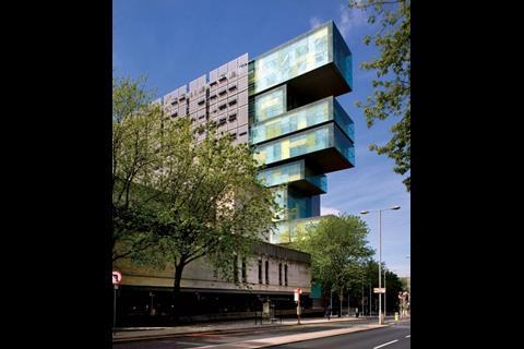
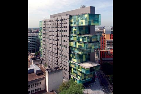
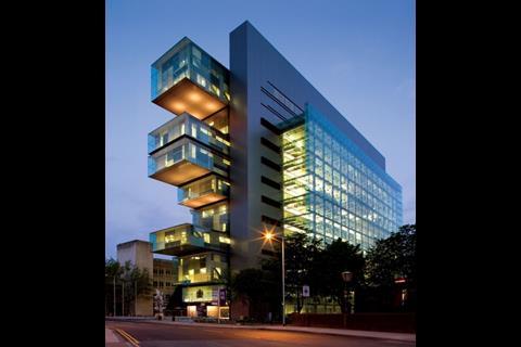
A 15-storey filing cabinet of a building is enough to stop any visitor to central Manchester in their tracks. Its delicate glass drawers have been pulled out at random and threaten to topple onto you as you cross the bridge over the Irwell river from Salford. At the opposite end, another random collection of drawers projects into thin air. One flank overlooking the Irwell is fronted by a projecting window wall of pure transparent glass. The other is overlaid by a mysterious patterned veil of grey steel.
Just one glimpse is enough to establish this as the most exciting new building in Manchester. It fits with no special pleading into a higher European league of architecture – a requirement of the international design competition for the building.
If it’s hard to identify the source of such a fresh yet refined design, that’s because it’s the first UK building by Australian architect Denton Corker Marshall, which is also designing the visitor centre at Stonehenge.
What makes this flamboyant, see-through building all the more striking is that it belongs to that most buttoned-up and inward-looking building type: courthouses. With a floor area of 34,000m2 that packs in 47 civil courtrooms, it is the largest court building to be developed since London’s Royal Courts of Justice in the Strand was completed in 1892.
From the start of the project, it was championed by Tony Blair’s first lord chancellor, Lord Irvine, who wanted it to emulate the Royal Courts as well as aspire to European architectural significance.
One other factor militates against such a spectacular result: it was procured by commercial developer Allied London as part of a public sector development scheme – a sort of PFI without the facilities management.
“This is one of the most complex buildings in the UK. It’s trying to do a lot of things simultaneously, from internal functions to external visual impact,” says Stephen Quinlan, director of Denton Corker Marshall’s London office. “And that makes for a complex solution.”
Denton Corker Marshall has coped with the complexity by rigorously separating out and articulating the functions of the building. It is an approach that answers the strict legal demands of HM Courts Service while fitting neatly into the functionalist tradition of the modern movement.
This no-nonsense approach has given the building its bold visual expression. This is immediately evident from the marked differentiation between its four elevations. Even the glass drawers are an uncontrived expression of the building’s functions.
This process of articulation started when Denton Corker Marshall split off the civil court accommodation from the 20,000m² of commercial office space that formed part of the competition brief. This confined the courthouse, the larger of the two buildings, to half the site, squeezing it up to 15 storeys.
The standalone 15-storey block gives the courthouse a strong presence in the city.
This is further emphasised by placing the building’s front door at its narrow end beneath the projecting glass drawers and facing Bridge Street, one of the few approaches to Manchester city centre across the Irwell from Salford.
While the height and form of the courthouse imposes itself on the city, the large expanses of clear glazing open up its internal workings to passers-by. The window wall facing the Irwell drops down to the floor of a huge light-filled atrium, where clients and their lawyers can be seen in discussion or making their way to the courtrooms.
The glass boxes that project from either end at high level enclose the courtrooms, although the transparent glazing here is symbolic – the views inside are blocked by opaque linings to the inner leaf.
Multistorey court buildings are virtually unheard of because of the strict legal requirements for separate circulation routes for the public, criminal defendants and judges. But as Quinlan points out, a civil courthouse such as this one has no remand prisoners that must be escorted to and from cells in the basement, so only two segregated circulation routes were called for. This made a high-rise solution easier to achieve.
The key to the internal configuration is that the courthouse has been cleanly sliced up, both vertically and horizontally. “We had to think in three dimensions about how the building operated,” says Quinlan.
Vertical slicing of the building has produced three elongated layers standing in parallel that neatly separate the public from the judges’ walkways. The vertical layer inside the window wall is the main atrium serving the public and lawyers.
The layer along the other side has restricted access and contains the courtrooms, along with court offices and judges’ chambers, which have all been stacked together between two rows of columns 12.8m apart. This layer also comes with narrow corridors exclusively for judges just inside the perimeter wall.
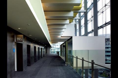
An intermediate layer is a public circulation spine containing lifts, stairs and upper-level concourses overlooking the atrium.
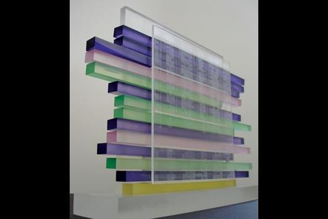
Horizontal slicing of the building has produced 15 narrow, elongated floor plates like tubes, most of them containing courtrooms strung out in a row. All the tubes are of different lengths, ending in the glass drawers that project varying distances at either end. “The length of each tube is determined by the grouping of the courtrooms, and this
gave us flexibility,” explains Quinlan. The built-in flexibility proved its worth during the 14-month design period, when the courtrooms were increased from 38 to 47 by extending the glass drawers at either end.
The building interior is dominated by the 12-storey atrium. “It takes away the stress of coming to court and immediately allows people to orientate themselves in the building,” says Denton Corker Marshall’s other London-based director, John Rintoul.
The clear glazed window wall that stretches along one side provides a reassuring link with the outside world while, overhead, pods project seemingly at random into the upper void of the atrium, not unlike the projecting glass drawers at either end of the building. Open concourses on each upper floor share the excitement of the space and give access to the pods, which serve as waiting areas or meeting rooms for clients and their lawyers.
The Civil Justice Centre uses all the principles of Smart PFI. It shows the way forward
Jack pringle, RIBA President
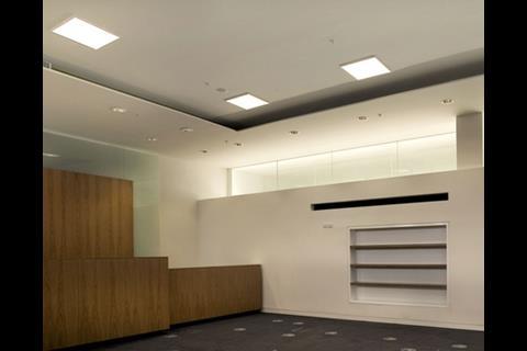
Compared with the exhilarating atrium, the courtrooms are sober rectangular boxes. Only those at both ends of each floor have tiny glimpses to the outside world. Their redeeming feature is the natural daylight that filters in from either side through an ingenious complex system of clerestory windows and light shelves.
A closer look at the design and finishes reveals a contemporary updating of classic modernist principles. It is a determinedly rectilinear style, where each element is clearly delineated and bounded by flush, sharp-edged planes. The long lift entrance frontage to the atrium and concourses, for instance, is a smooth sheet of stainless steel with a velvety matt finish that folds crisply without joints, mouldings or shadow gaps into the rectangular lift recesses.
The projecting glass drawers reveal another refinement to the style. They have a delicate feel, contrasting with the severe frame of grey steel out of which they slide. Their double-glazed walls are separated by a wide walk-through cavity and the internal leaf comes in an abstract pattern, like a Mondrian painting. Opaque and clear-glazed panels come in rectangular and diagonal shapes and muted colours ranging from grey to creamy yellow.
What really adds to the delicate effect is that the floors and roofs to the walk-through cavities are barely thicker than glass, since the depths of the structural floors and roofs are concealed behind the opaque inner leaves.
The grey steel veil covering the east face of the building comes with a see-through pattern not unlike Arabic window shutters, although the western industrial character relates it to the city outside.
Rising up 1m in front of the building’s glazed curtain wall, it is a screen of grey-painted stainless-steel plates that have been perforated into a translucent veil. Rectangular holes of various sizes are cut out of it and in places there are horizontal light shelves. The permutations provide a variety of levels of daylight, shading, visibility and privacy to the accommodation behind.
Denton Corker Marshall has delivered a scrupulously functional building for the Manchester Civil Justice Centre. It has also introduced a strong civic presence to the city centre and provided exhilarating interiors with natural daylighting and ventilation. As such, it establishes an inspiring benchmark for public buildings which any prime minister could take pride in.
The price of justice
The Civil Justice Centre is held up as a model of Smart PFI, in which the design is procured separately from the site and private developer, resulting in a higher quality building. Strictly speaking, it is not a PFI but a private developer scheme, as it carries no continuing requirement for facilities management.
The verdict on the high-quality outcome comes from all stakeholders concerned, from two successive lord chancellors, through Manchester council to the private-sector developer, Allied London, and including the architect Denton Corker Marshall and the client’s two architectural advisers, former Royal Fine Art commissioner Ian Ritchie and Paul Rynsard of Feilden & Mawson.

Robert Angel, project sponsor for HM Courts Service, recalls that the high aspirations were set at the outset of the project in 2001 by Lord Irvine, then lord chancellor. “Given the scale of this building and its fairly tricky site, he seized on it to demonstrate the government’s commitment to Tony Blair’s Better Public Buildings initiative. He said he wanted it to achieve European architectural significance.”
About the same time, award-winning architect Ritchie was invited to advise the lord chancellor’s department on how to achieve architectural excellence. He recommended an unprecedented dual approach in which the architectural design would be commissioned through an open design competition and developer with site tendered quite separately.
The architectural competition attracted more than 100 applicants. At the same time, developers were asked to bid with a suitable site, and Allied London was chosen for a site in its £1.5bn business district, Spinningfields. Then, after 14 architects were interviewed, three were invited to submit designs for a fee of £75,000 each. As well as Denton Corker Marshall, they were Richard Rogers Partnership and Pringle Richards Sharratt.
The competition’s eight judges included the heads of key stakeholders, such as Richard Leese, leader of Manchester council, Sir Hayden Phillips, permanent secretary of the lord chancellor’s department, and Judge Penry Davey, the civil courts’ senior presiding judge.
The budget was calculated according to the Treasury’s private development rule book, the Green Book. The quality of detailed design was fixed by commissioning the architect to complete detailed design to RIBA Stage D before the development contract was signed with Allied London.
For the 14-month period until the contract was signed, Allied London supported the project at risk to the tune of £8.5m and then passed on part of the risk to Bovis Lend Lease in a guaranteed maximum price design-and-build contract. Denton Corker Marshall also claims that more than £1m of its due fee was at risk during this period.
Project sponsor Angel had the unenviable task of monitoring the project from a position between the Courts Service and its team of consultants on the one side and Allied London and Bovis Lend Lease on the other. Yet he says: “Allied London and Bovis never confronted us saying they couldn’t afford something. I have had more sticky situations on much smaller schemes”.
Barrie Marshall, of Denton Corker Marshall, provides more insight over the design impact by developer and contractor: “We were novated to the builder when design documentation was 10% or 15% complete,” he says. “So there was a lot of back-of-house detailing completed under the builder, and that was susceptible to change. Plasterboard details, for instance, aren’t quite as perfect as we’d like them to be. But we concentrated on front-of-house detailing and we’ve managed to hold on to that pretty crisply.”
His partner, John Denton, gives a realistic verdict on behalf of the architect. “Given it’s a commercial building underwritten by government, I think we’re pretty happy with what we’ve got,” he says.
For his part, Allied London chief executive Michael Ingall says the contract’s contingency sum of 3% “has probably been spent to protect the quality”. But to him it was all worth the expense: “The Civic Justice Centre enables the whole of the new Spinningfields development to be leveraged up – we can’t now reduce standards with mediocre brick, punched-window buildings!”
As incentives, Allied London has offered Bovis a share of the developer’s profits on completion and double the typical contractors’ profit margin. “If contractors’ margins are too low, there could be an awful deteriorating relationship with the supply chain to the client’s disadvantage,” says Ingall.
Despite the incentives, Bovis’ final handover of partial fit-out took place six months late on 29 June and this will incur liquidated damages. Even so, project sponsor Angel is not too perturbed. “Since we own all the buildings we occupy at present, there’s not much pressure for us to move out straight away.”
To Jack Pringle, who has championed Smart PFI during his two-year stint as RIBA president, “the Civil Justice Centre uses all the principles of Smart PFI, where you get the right design and the right relationship with the client. It shows the way forward”.
Downloads
Floor plan
Other, Size 0 kbBuilding cross-sections
Other, Size 0 kbVertical layering
Other, Size 0 kb











No comments yet