As one half of the duo behind leading lighting architects Speirs and Major Associates, Mark Major is passionate about his work. Just don’t get him started on coloured schemes, says Stephen Kennett
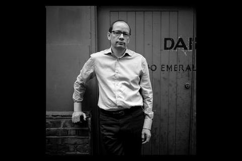
In Emerald Street, central London, a small enclave of architects, designers and other creatives nestles between the West End and the City. Speirs and Major Associates is evidently right at home here, in a bright, uncluttered warehouse studio shot through with flashes of coloured lighting. Behind the sliding doors of the first floor studio’s meeting room, an immaculately turned out Mark Major is talking about his approach to lighting design.
“You have to be bold enough with lighting to move forward with very strong ideas,” he states in no uncertain terms. “We will not hold back and say ‘that’s going to be really difficult to do’ – I think if we had done that, a large percentage of our better projects simply wouldn’t have happened.” And with schemes such as Gateshead’s Millennium Bridge, the Millennium Dome and the Gherkin under his belt, it’s difficult to argue with that.
A few minutes earlier, Major had exuded a sense of urgency as he pulled up his chair. He’s quick to explain the reason: “Winter arrives and suddenly clients start thinking about lighting – then they want schemes in next to no time.”
It’s just as well, then, that over the years Speirs and Major has honed a design process that allows it to move swiftly forward with its concepts. “What we are all about, is coming up with ideas quickly and being prepared to move on with them and change them,” explains Major. In most projects, they are involved from the outset. “We’re not applying light as a cosmetic add-on,” he says. “The ideas we put forward become very integral parts of the architectural scheme.”
The practice approaches every project from a fresh viewpoint, irrespective of size. In the early stages, the talk is always about light. “Often we’ll move forward on a scheme at concept level with a client, where we know what we want to do but we may not immediately have the precise solution in the back of our minds,” says Major.
Strong ideas are essential, and Major believes one of the practice’s greatest assets is its ability to communicate these ideas so that the client can “visualise and buy in to the lighting effect”. He doesn’t, however, believe in spending time creating photo realistic representations or dozens of Lightscape models, deeming them time-consuming, expensive and most importantly, slow. Maybe it’s his architectural training.
Instead, sketches are the lynchpin of this communication process. “It also means that if changes have to be made immediately, you can make them quickly; you can be reactive,” he observes. This is especially important in larger, complex, projects “where things don’t move in a nice steady step-by-step process.”
Only then, says Major, will they begin to firm up on the design and start to look at how many lighting points are needed, what the sources are likely to be and how they will be controlled.
Propped up in the corner of the meeting room is a rudimentary wooden box concealing a light fitting. “This,” says Major, “is what we refer to as a ‘lighting test’.” He’s quick to stress that it isn’t something that is shown to a client. “It’s part of our design process and is more to do with lighting effect, buildability and to assess if what we want to achieve is physically possible.”
The test in question is for a bridge scheme in Glasgow where no photometric data exists. “We have to approximate the photometry by rigging up a test and doing point by point measurements to say ‘are we dreaming here or is it really going to work?’”.
What a client is more likely to see is a full-scale mock-up of a small section of the scheme. “There’s no substitute for the physical reality of seeing a lighting effect and what it does to make sure a client has fully grasped the essence of what they are getting,” says Major, getting into his stride now. “You can show them a sample light fixture, but so what? You can power it up, but that doesn’t tell you how it is going to change the space – so mock-ups and testing are a very important part of what we do.”
On the more complex engineering projects – bridges in particular – mock-ups also help with fine-tuning and allows contractors to get a clear idea of the challenge and how they might integrate the lighting into the overall design.
The engineer’s perspective
Major always wants electrical engineers to be involved early on in the design process – to smooth the integration of the lighting into the overall scheme and assist in coming up with more buildable, easier to install, cheaper and smarter engineering solutions.
But he acknowledges that one of the big problems for electrical engineers is that they are last in the chain. “It’s often difficult for us to finalise our layouts if, say, the architect hasn’t decided on the floor finish. Reflectance [of the floor] is crucial to the scheme and we may only be in a position to firm up the lighting design quite late in the day. I’m very sympathetic to them when it happens, but I don’t think there is an easy answer to it.”
What he perceives in the market place at the moment is that electrical engineers are starting to work on a schematic and specification basis, with a lot of the detail work (on construction management projects) being carried out by contractors. “So quite often, there is that second bite of the cherry, where you are working with a completely different type of electrical engineer, employed by a contractor, and talking about the absolute end product.”
On straightforward projects, Major doesn’t see the traditional set-up of the engineer and lighting designer changing in the short term. But changes are beginning to happen in other sectors. The practice has just finished relighting the interior of St Paul’s Cathedral, where a systems integrator was employed to help pull together the light, controls and electrical systems. “Increasingly, I think certain types of lighting project will require specialist electrical engineers or systems integrators – someone with that broad range of knowledge that can bring the disparate systems together,” he says.
“Already, if you are doing a lighting design in, say, Las Vegas or in the entertainment business, you will work with an electrical engineer who is used to doing work in environments with a lot of media and which requires a very specialist input both on the contracting and the design side. I have to say when you are working in that way, the project is a lot easier because you are working with people who know instantly what you want to achieve.”
Energy efficiency
The interior of St Paul’s Cathedral scheme, which took over three years to complete, was interesting for a number of reasons, not least that it was a Grade I listed building. All the missing chandeliers were replaced, but it is the roof’s lighting that Major emphasises. This has been achieved using just 35 W metal halide fittings. The highest-powered lamps used in the scheme are 100 W and most sources are dimmed.
“I’m proud of the fact that the architectural effect we are achieving uses very little energy. It’s a more intelligent design,” enthuses Major. “Anyone could take a set of high-powered theatrical light fittings, put them on a dimmer and, given enough time, could work out how to make a cathedral look good, but we have a responsibility to be intelligent about the way we tackle lighting design.” For the same reason, he isn’t prepared to let technology dictate a lighting solution. “What we won’t do is say there is some cool technology out there, we must use that. We won’t let the tail wag the dog.”
Energy efficiency is a consideration for all lighting schemes but, with the latest revisions to Part L, is legislation the answer? “I think lighting designers have been cognisant of the need for restraint. We are quite often fighting our corner for lighting things in a way that avoids overlighting or duplicating lighting.” Most lighting designers use their judgement to define the quantity and quality of the lighting in a sensible way that will work with the scheme, says Major, and usually the energy used or the approach taken will be fairly consistent with the aims of Part L. “They don’t need legislation to push them in to doing things. I still think Part L has the potential to produce incredibly banal lighting schemes.”
Legislation aside, if there is an area that Major is critical of, it’s the use of colour. In his view, London is suffering from an outbreak of colour disease at the moment. “Because lighting is relatively unregulated, any Tom, Dick or Harry can buy a set of floodlights, put a pink filter on them and make their building look miles more important than it needs to be.“
What designers should be doing, he argues, is looking at a building in the context of its surroundings. “A client’s initial thought might be to make the building an advert, but our response will be how we can go about satisfying the brief without having a detrimental impact on the urban fabric.”
As the designer behind such schemes as the Millennium Dome and the proposed Croydon skyline (where 34 buildings were to be illuminated with colour as a single co-ordinated light show), this might sound a tad hypocritical. He insists this isn’t the case. “It so happens that a lot of our published schemes are the ones that use colour, but they are very unusual schemes. For instance, the Croydon Skyline was an economic thing intended to attract people to Croydon after dark. So there are good reasons for using coloured light, it’s not always purely random – whereas to me, a lot of the coloured lighting effects in the capitol right now are akin to someone buying a bucket of paint and just arbitrarily painting their building a colour.”
Is there one scheme that Major would particularly like to get his hands on? The Millennium Eye would be an obvious choice, he says, but after some reflection it’s the lighting of the buildings around Parliament Square that he finds particularly troubling. “What I find interesting is that it is not lit contextually. You’ve got this great collection of buildings and they’re all individually good lighting schemes, but I don’t think they have been designed in the context of each other in a cohesive way. It would be very interesting to light that area as a composition of buildings.”
Next stop: Greenwich
This strategic, bigger picture keeps cropping up throughout the conversation with Major. The latest, and by far the biggest, scheme is a lighting strategy for the Greenwich Peninsula. This is an environmentally sensitive zone where the client is stressing the need for a sustainable, low energy environment.
“What we are aiming to do is lay down a strategy that is robust enough at one level but flexible enough at another to make it work. I see it as even more of a challenge because it is opposite Canary Wharf, where the lighting has developed in a far more piecemeal way over the years.”
Major is passionate about the practice’s current schemes, but not dogmatic. “You have to understand from the beginning that there are constraints. If we find that something is impractical or unaffordable after all, then at that point we are big enough to let go of things.”
But, one suspects, that doesn’t happen very often. As he made clear at the outset, difficulty doesn’t count as a constraint in his book.
Spreading the light: a selection of Speirs and Major Associates’ schemes
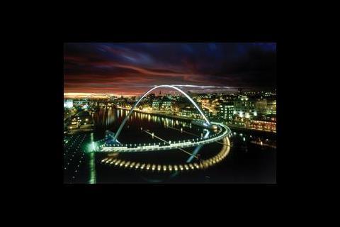
1 Gateshead Millennium Bridge
The Gateshead Millennium Bridge is the world’s first tipping bridge – it can be tilted to allow river traffic to pass beneath it. The surface of the arch is cross-lit with white and changing colour used in such a way as to minimise light pollution. The underside of the deck is illuminated, to maximise reflections in the surface of the water through the use of narrow beam sources which are accessible through the deck. White LEDs recessed in the deck delineate the cycle and pedestrian routes and catch the surface of the vertical balustrades and horizontal steel wires.
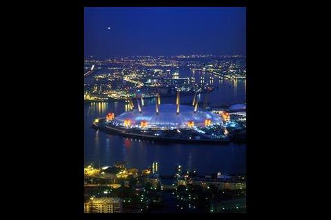
2 Millennium Dome, Greenwich
The yellow masts of the Millennium Dome are lit to maintain a three-dimensional appearance, while the cylindrical plant towers were highlighted in red to create a sense of energy. Overhanging eaves and curved cladding were washed with light from the ground to define the perimeter. The architectural lighting of the Dome surface was a simple but effective daytime (white) and evening (blue) wash to the fabric. The uplighting helps lift the space on dull grey days and define the circulation, as well as reducing the contrast between the translucent cladding system and the edge of the roof.
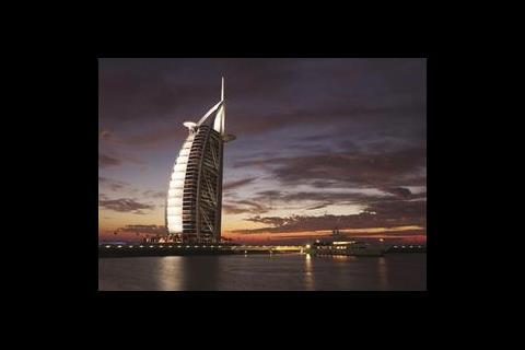
3 Burj Al Arab, Dubai
The dramatic Burj Al Arab has become the iconic symbol for Dubai and the dynamic illumination is a key part of its overall lighting scheme. The massive white Teflon fabric sail (45 m wide and 180 m tall), which forms the external membrane of the main atrium, is lit with high-power colour-change luminaires. Regular shows provided by the changing colours and patterns are supplemented by individually programmable strobes set into the exoskeleton and spike. At key moments, skytrackers project moving beams of light into the sky.
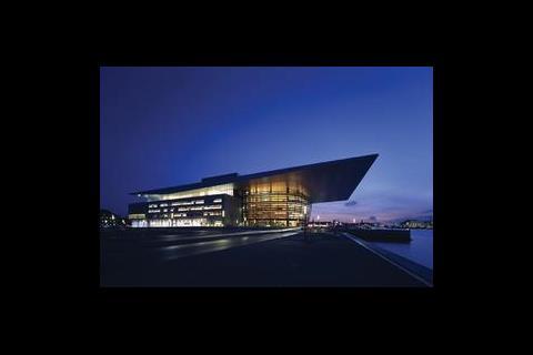
4 Copenhagen Opera House, Denmark
The lighting concept for the Copenhagen Opera House was conceived to focus activity within the foyer, revealing the mingling crowd as dynamic silhouettes. There is no external illumination of the solid parts of the building, allowing the window apertures to glow and making the overhanging roof to appear to float. The general foyer lighting comes from a a hidden cove wrapped around the floor plates.
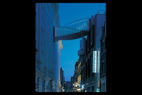
5 Bridge of Aspiration, London
The Bridge of Aspiration connects the Royal Ballet School to the Royal Opera House, across Floral Street in London’s Covent Garden. Its understated lighting was dictated partly by the planners, who didn’t want the bridge to become a bright element in the streetscape. Instead it provides a sense of intrigue, with the lighting strategy being more about the internal experience for the dancers crossing the bridge. LED fittings are used to pick out the twisted structure, while the lobbies at either end are lit with low wattage dichroic downlights.
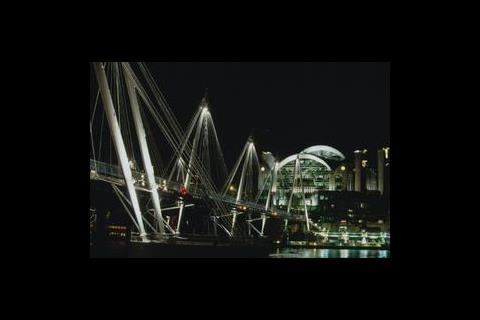
6. Golden Jubilee Bridges, London
The Golden Jubilee Bridges span the river Thames. The downlighting concealed within the structure at high level creates a rhythm of light along the deck. Pedestrians pass in and out of the light, creating a dynamic flow that is visible from the banks of the river.
From architecture to lighting
Speirs and Major Associates was formed just over two years ago, but Mark Major’s association with Jonathan Speirs dates back much further. There are many parallels in their careers, starting with the fact that both trained and practiced as architects before focusing on lighting design.
While this was perceived as a tangential move by many observers, Major explains that: “In our view, it was to do with seeing light as an extension of what we were doing as architects. It’s building with light as opposed to bricks and mortar. Creating a sense of space, defining character – we saw amazing opportunities to do that.”
The pair first worked together in 1984, when Major took up a job at the Lighting Design Partnership – a firm co-founded by Speirs that was instrumental in pioneering independent lighting design in the UK.
Both eventually branched out on their own, before re-establishing a working association in 1993. Speirs and Major Associates was formed in 2003, with Major heading up its London studio and Speirs based in Edinburgh. “I was impressed with his artistic talent as soon as we met – and as we began to work together, his design acumen and analytical thinking shone through,” says Speirs of Major. “ We are both quite different people, but I believe that is what makes our partnership so successful – we
complement and balance each other.”
Source
Building Sustainable Design









No comments yet