Mecanoo’s £189m Library of Birmingham is a triumph - once you get inside
Few modern British cities have grasped the transformative power of architecture and urban planning as enthusiastically as Birmingham. While London squabbles over skyscrapers, Edinburgh vacillates over trams and Liverpool and Brighton tinker with their waterfronts, Birmingham, with virtually no local opposition, has charged full steam ahead with a comprehensive renewal programme that has not just changed its city centre but completely reinvented it over the past 20 years.
From Brindleyplace to the Mailbox, Beetham Tower to the Cube, Selfridges to the Bullring, the spoils of this audacious civic campaign are littered across the city’s urban fabric. And it is not over yet. Enticing glimpses of the shimmering metallic skin of the under-construction New Street station have recently been unveiled. And the 2030 Big City Plan is a pioneering programme by the council (Europe’s largest local authority) to define and enforce the kind of city-wide development vision that London, crushed under the segregation of its autonomous boroughs, can only dream of.
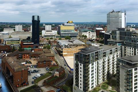
Birmingham’s compendium of new architecture often attracts critical controversy, but from a municipal point of view that is not the point. What is, is the specific marketing role these buildings serve, namely to wrest popular conceptions of the UK’s second city away from motorway junctions and industrial decline and use radical contemporary architecture to help redefine it as a youthful, cosmopolitan and dynamic place to be. Birmingham is striving for its “Bilbao effect”.
The latest attempt to capture it is arguably the most ambitious. The Library of Birmingham opens next week and at 31,000m², it is the largest public library in Europe. At a cost of almost £189m too, this publicly-funded institution will arguably be one of the country’s last expressions of public sector pre-recession largesse.
Designed by Dutch practice Mecanoo, the new library replaces the old Birmingham Central Library, a caustic concrete cauldron designed by John Madin and opened in 1974. Madin was to Birmingham something of what Richard Seifert was to London, a totemic, commercially successful yet divisive modernist figurehead, defiantly refashioning much of the city’s historic fabric in an uncompromising sixties and seventies quasi-brutalist style.
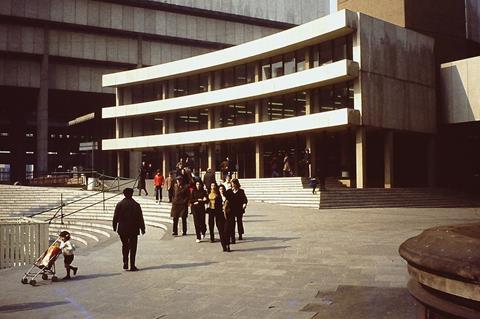
While many critics gushed over the old library’s plunging voids and soaring escalators, users and locals were considerably less impressed, while the city’s former director of planning and regeneration, Clive Dutton, slammed it as a “concrete monstrosity”.
Even Prince Charles - not everyone’s preferred architectural seismograph by any means - appeared to capture the popular view of the building when he dismissed it as “a place that looks like where books go to be burned rather than read”. The arguments over the old library will, like the building itself, be consigned to history when it is demolished next year.
The urban context
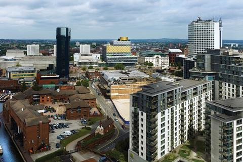
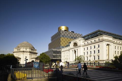
The new library occupies a commanding spot on Birmingham’s Centenary Square, an expansive, if architecturally disjointed, public space next to the old Central Library. Mecanoo’s building fills a void formerly occupied by a car park and right in the middle of the square’s northern edge, between Baskerville House, a neoclassical pile completed in 1938, and the cusped concrete mullions of Birmingham Repertory Theatre (the “Rep”), opened in 1971. Birmingham’s International Convention Centre (ICC), a rambling postmodernist sprawl designed by RHWL Architects in 1991, completes the square’s northern and western sides.
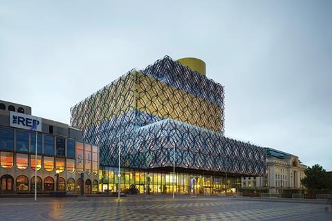
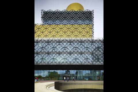
Externally, the library is split into a stack of glass boxes that gradually recede in depth until the summit is reached. A series of green, publicly accessible terraces are incorporated into the planes created by the recessed and projecting facades.
According to Mecanoo partner Francesco Veenstra, the library’s shifting volumes “help to address the variety of scale and massing found on its neighbouring buildings and the square itself”. Accordingly, the parapet line of the biggest box that projects furthest into the square is roughly level with that of Baskerville House next door.
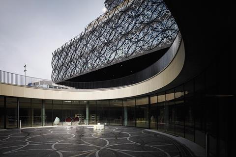
A large circular opening has also been cut into the ground directly in front of the library entrance, revealing a walled rotunda undercroft encircled by underground library accommodation. This is linked to the main building underneath the square.
Mecanoo founder Francine Houben admits to being “fascinated” by the series of railway lines, tunnels, roads and underpasses often hidden beneath the city, a sensation compounded by the overwhelmingly flat composition of her native Netherlands. The rotunda is partially devised as a means of “exposing” this typology.
Another key contextual driver was what Houben identified as the “red line”, a key east-west high pedestrian traffic route across Birmingham. The library and the square fall on the line and therefore Houben anticipates that the library’s role as a “destination” will aid accessibility and connectivity through the city.
According to Ian Ward, deputy leader of Birmingham council, the library will host “10,000 visitors a day and up to 3.5 million per year”.
Ever increasing circles
The glass boxes that comprise the building form are surmounted by a squat cylindrical drum enclosing, rather whimsically and completely invisible to the outside, the Shakespeare Memorial Room. This richly panelled and vaulted chamber dedicated to the playwright, who was born in nearby Stratford-upon-Avon, was built in 1882 and was the only part of the original Victorian Central Library spared when it was demolished in 1974. The room was incorporated, incongruously one must imagine, into Madin’s scheme before being dismantled and reassembled, for the third and presumably final time, to perch on the top of the new library.
Houben explains that she wanted the room encased in its gold, metallic drum to act as beacon to residents across the city. “Centenary Square rests on Birmingham’s highest hills so placing the Memorial Room at the top of the square’s tallest building means that it becomes a beacon of wonder and aspiration to the city’s residents and is visible from far and wide across the city.”
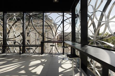
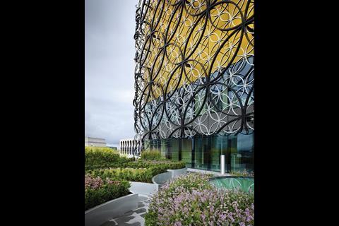
Houben’s explanation reveals the twin driving forces behind the architecture of the new library: concept and symbolism. And nowhere is the principle more powerfully expressed than on the metal tracery that completely encloses the building’s skin. The tracery is formed by a series of interlocking circles that enclose it like a rigidly clasped veil.
The glazing proceeds uninterrupted behind the circles, with the exception of the fifth and sixth levels, housing the city archives (containing one of the world’s largest collections of Shakespeare material) and the rooftop drum containing the Memorial Room. Both these areas are expressed as continuous gold bands wrapped around the building to symbolise the precious content that lies within.
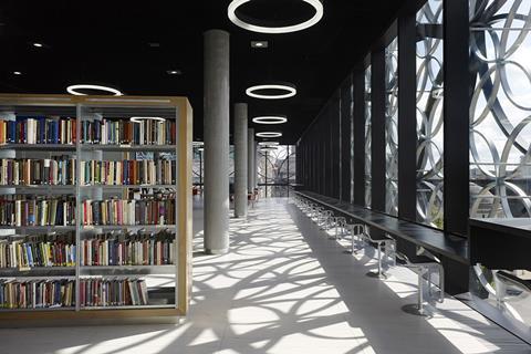
According to Houben, the circular cladding motif was devised to “reference the city’s industrial heritage of craftsmanship and jewellery”. Interestingly, Make’s Ken Shuttleworth used this same justification for his Cube building nearby, which of course looks completely different. Houben also reveals that the circles are an “archetypal form that embody unity, universality, timelessness and knowledge and cast shadows inside the building that embrace its users and inspire a deeper connection with the city’s memories and past”.
Deciphering architectural concepts is rarely an easy task at the best of times and this one, while undeniably well intentioned, appears more turgid than most. The problem with high-concept architecture is that the concept is lost on pretty much everyone other than the architect. Houben may see craftsmanship and memories but 99% of the people who pass the library will see metal hoops stuck on a glass box.
Of course, there is nothing at all wrong with symbolism in architecture, it is a powerful, ancient ritual that enables buildings to convey a message and thereby enrich their relationship with their users. But when concepts are as contrived and didactic as this, they become laboured and implausible, rather like a flashing neon sign on the top of the Empire State Building spelling out the word “SKYSCRAPER”.
It is not just the motivation behind the concept that grates, but its aesthetic application too. The circular motif is unilaterally applied with virtually no subtlety or relief, thereby espousing gimmickry and tokenism rather than character. And for all its attempt at embroidered camouflage, the facades still bear an unsettling resemblance to those of an office block or multi-storey car park. Even worse, with its gaudy skin, staggered profile and rooftop funnel, the building sometimes assumes the rather more comical appearance of a food processor in drag.
All the effort concentrated on the facade has also presumably been to the detriment of a far more important civic component, the entrance. Squeezed into a revolving door somewhere along a continuous glass curtain wall, the entrance is virtually imperceptible, thereby squandering a vital opportunity to humanise the otherwise abstract facade and sorely undermining the building’s genuine attempts at public realm engagement elsewhere.
But the Library of Birmingham’s biggest misdemeanour is not to be found in Birmingham but 400 miles away in The Hague. Back in 2009 Mecanoo submitted an entry for a competition to design a new International Criminal Court in the Dutch capital. The scheme was never built but its filigree skin of interlocking aluminium circles bears an eerie resemblance to Birmingham’s facade. In fact, from most angles, it looks exactly the same, a point raised by many in the media when the designs were unveiled in 2009. Recycling of designs - sometimes your own, frequently someone else’s - is as ancient and venerable a tradition in architecture as symbolism. George Gilbert Scott was happy to admit he had originally designed London’s St Pancras station to be the Foreign Office in Whitehall and it does not take Interpol to identify similarities between Norman Foster’s Gherkin and Jean Nouvel’s Torre Agbar in Barcelona. But on a building that has allegedly gone to such lengths to appear contextual, this level of duplication achieves the opposite effect.
Journey of exploration
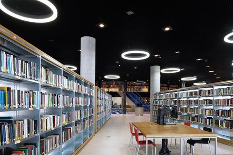
The heavy conceptualism continues internally, but this time far more successfully. The entrance lobby is conceived as a noble, double-height space flooded with natural light and with a hard slate floor underfoot happily suggestive of a public realm that has been sucked inside the building. Reading spaces and public areas generally are generously proportioned and well lit, offering sweeping panoramas out across the city.
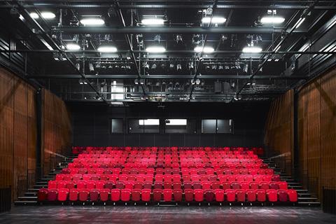
Even Houben’s circular shadows add a touch of intimate delicacy to the otherwise hard-edged spaces. A bright yellow children’s library has been carefully folded into the lower ground floor, only partially glimpsed from above via amphitheatre seating that rises from it into the foyer.
But it is the route through the building, rather than the spaces themselves, that excites. Houben explains that she wanted progression through the building to “mirror the path to knowledge, to be a journey of exploration where everything is not instantly revealed, but uncovered by stages as you move towards the top of the building.”
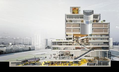
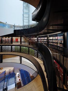
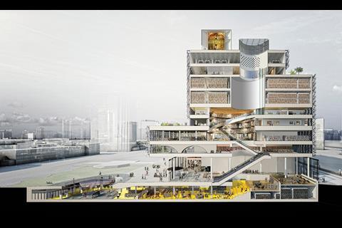
And this time, it works. Of all the architectural drawings produced for the building, by far the most compelling is the section (see image above). Slicing through its bulk reveals a series of staggered, stacked rotundas piled on top of each other dissected by an intestinal zig-zag of escalators, lifts and stairs.
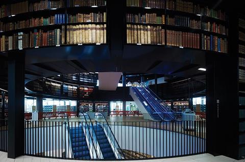
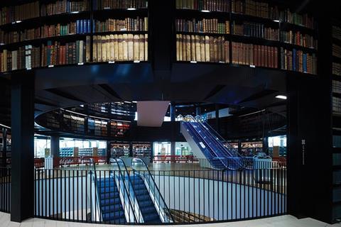
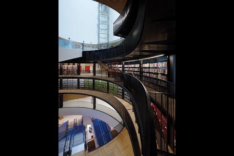
Accordingly, a monumental escalator shaft rises from the ground floor lobby, offering the first tantalising glimpse through the cavernous stack of jagged rotundas above and the ocular skylight piercing their summit. Eventually, the book rotunda at the heart of the library is reached, a magnificent circular chamber sleekly trimmed with black aluminium and overhanging balconies and, on every plane available, rows and rows of books.
More escalators follow and then, most improbably of all, a travelator zooms up to the next rotunda, plunging the visitor into a clinical white funnel from which a solitary glass lift shaft soars upwards to the staff areas and, ultimately, the Shakespeare Memorial Room.
With its theatrical sequence of revelation, concealment and surprise and its constantly shifting variety of chambers and vertical routes, the interior dramatically combines the operatic titillation of the baroque with the manic, illusory frenzy of an Escher sketch. Like the exterior, this is architecture as allegory, but
it works here because it is not executed as superficial embellishment but as complex spatial manipulation that endows each part of the building with its own unique role and identity.
As the visitor passes though the library, the progression really does resemble the journey Houben alludes to - it is only at the uppermost rotunda, when all the layers of void and movement lower down have been peeled away, that the light pouring in from the skylight above is fully revealed. It is just a pity that none of this playful ingenuity is visible from the outside.

Project Team
client Birmingham City council
architect Mecanoo
maIn contractor Carillion
structural engineer Buro Happold
cost consultant Capita Symonds






2 Readers' comments