The brief for Oxford's business school, now nearing completion, fell into the latter type, comprising 23 lecture theatres and seminar rooms and more than 100 offices for staff and researchers. Fortunately, the school had a benefactor in the shape of the Syrian-born tycoon Wafic Saïd, whose £20m donation successfully boosted the building into the more gracious Oxbridge mode.
As designed by Jeremy Dixon.Edward Jones, architect of the Royal Opera House and National Portrait Gallery, the completed building does indeed revolve around a large central quadrangle, and features a generous common room, library, landscaped garden, four minor quadrangles and an open-air amphitheatre. These expansive amenities, combined with high-quality and impeccably detailed materials, give the building a classic sobriety and stateliness that befits the ancient university and historic city it forms part of.
The dignity of the completed building, however, belies a string of scandals that dogged its development. Oxford dons have always viewed the worldly sphere of business with distaste, and the school's first director, John Kay, resigned over lack of support from the university before the building was completed. Saïd's munificence was viewed with even more suspicion, amid allegations that it was money garnered from arms dealing. The first site proposed for development, a playing field in the east of the city, was slammed as an outrage and overturned at a public inquiry. The second proposal on a large site in front of the main railway station also provoked noisy opposition and even sit-ins, as it housed the foundations of an ancient abbey and a disused train shed that was a forerunner of Joseph Paxton's Crystal Palace of 1851. There were even claims that Number 10 intervened in order to speed up the planning process of the controversial building.
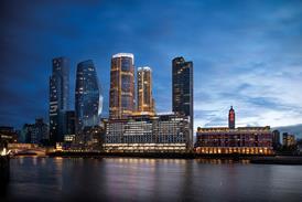
In the end, it was no problem to dismantle Paxton's prefabricated structure and re-erect it at the railway museum in Didcot, while the foundations of the abbey have been preserved beneath the gardens to the rear of the new building. With these issues now resolved, the university's vice-chancellor, Colin Lucas, is well pleased with the new building and its location. "It's supposed to be a statement," he says. "I wanted it to be there because it represents the interface between us and a different sort of world." The most westerly of the university buildings, it mingles appropriately with the city's industrial and commercial businesses. The architect has been particularly keen to celebrate the closeness to the railway station, which links the school and its staff with the business capital of London. The focal point of the building is a prominent green spire that greets commuters as they walk out of the station.
The project also started inauspiciously for Dixon Jones, which was appointed after winning against limited competition for the first site. "Saïd told us he didn't like modern architecture," recalls Ed Jones. "But we were wedded to modern architecture and we weren't prepared to do a piece of pastiche. It emerged that he was pretty keen on a symmetrical building, and in the end, we agreed to do something sober, with a symmetrical axis to the building."
Still, having a rich patron brought special compensations. While preparing the brief, the project team was flown in Saïd's personal 160-seat jet to visit business schools across north America.
"The director liked the informal, interactive style of organisation of west coast schools," says Sir Jeremy Dixon. "And we preferred the buildings on the east coast, which were quite formal and compact. So we have tried to create an ordered environment that enables informal interaction; discipline with a sense of freedom."
Dixon Jones' ordered plan revolves around a central axis made up of the main internal and external spaces. In sequence, they are a large three-storey porch in front of the main entrance, a spacious entrance hall of columns, a large rectangular courtyard and, at the rear, a common room for staff and students overlooking the landscaped garden. On the upper floors of this central axis are a two-storey library at the front and a large open amphitheatre above the common room. All these spaces are generously proportioned to encourage scholars to perambulate in discussion.
The central axis is flanked by more intimate internal and external spaces. In an original and subtle architectural touch, the symmetry of the central core atrophies progressively into asymmetry towards the perimeter. For instance, the central courtyard is flanked on either side by a stately double-storey-height collonade, but the left one is enclosed in glass whereas the right one is open to the elements. And beyond the colonnades lie two minor courtyards on either side, but the ones on the left are at first-floor level above the lecture theatres and the ones on the right are at ground level.
The four minor courtyards are bounded on three sides by seminar rooms, and act as attractive external discussion spaces. The two longitudinal colonnades and a criss-cross pattern of secondary routes and passageways are all designed to engender chance meetings between staff and students. The central symmetry of the building also brings a more practical benefit: it gives the visitor a strong sense of orientation in the labyrinth of rooms.
Even the lecture halls are based on Harvard University models. They are fitted out in horseshoe arrangements of fixed desks, replacing the traditional British us-and-them relationship between lecturer and students with one of all-round debate.
Externally, the building has markedly different facades on its three public sides. The rationale, Jones explains, is that the building should be viewed from the outside as a piece of urban design, rather than the external expression of a business school. Dixon adds: "The building opens itself to and engages with the city."
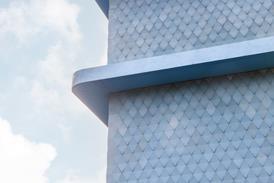
As a piece of urban design, the building creates two squares in what used to be a scrappy car park and collection of bus stops outside the station. The side facing the station is now a colonnade in banded brickwork culminating in the green spire at one end, giving a sense of arrival to commuters. The front elevation is the large porch beneath a canopy of silvery brises-soleils at roof level. This porch is effectively a semi-public piazza, subtly segregated from the pavement by glass balustrading and a slight change in level. The other elevation facing a side street is more restrained.
The dominant green spire is outlandish, though far from repellent. It is intended as the business school's contribution to Oxford's dreaming spires and doubles as a plant room. Dixon claims its shape was inspired by the stepped spire of Nicholas Hawkmoor's St George's church in Bloomsbury, but this sits atop a base of classical porticos and culminates in a large statue of the saint. In fact, there is nothing either dreaming or Roman about the new spire, which is a diminishing set of metal boxes that brings to mind a Middle Eastern ziggurat or stepped minaret. Both Dixon and Saïd – an Oxford graduate and Palladio aficionado – reject such interpretations as fanciful. But the spire may well be the one controversial aspect of the building that lives on after the development scandals have all been forgotten.
Spire aside, the architectural style has a stripped classicism like that of the pre-war Italian Rationalists, with strong echoes of ancient Rome. This derives from the symmetrical layout, the internal and external colonnades and a limited palette of noble but not luxurious natural materials, the innate solidity of which is expressed through plain, unadorned detailing. The materials include honey-coloured brickwork, creamy limestone and patinated copper externally, and maple and oak timber and white-painted plaster internally. All of the extensive IT cabling is concealed beneath raised floors to retain the clean lines.
Though quite contemporary, the school has a solid, monumental style that complements the generosity of spaces in the building and design contributions to the city. In these ways, it achieves Saïd's stated objective of providing "a world-class building".
Downloads
Plan
Other, Size 0 kb
Credits
client The Saïd Business School Foundation and the University of Oxford architect Jeremy Dixon.Edward Jones project manager GTMS structural & services engineer Whitby Bird & Partners landscape architect Whitelaw Turkington quantity surveyor Gardiner and Theobald main contractor Holloway White Allom


